In this non-profit design project "Art Politics in light of the Russo-Ukrainian War" operated by The Social Canvas Project, I’m responsible for designing a user-friendly user interface design for the official website, illustration asset, professional business card for the organisation, innovative invitation poster, presentation slide layout design, motion graphic animation, creating a variety of Art Politics in light of the Russo-Ukrainian War event floor plan and creative stage design to provide a more interactive and considerating audience experience with Figma, Adobe XD, Adobe After Effects, Adobe InDesign, Adobe Illustrator and Adobe Photoshop.
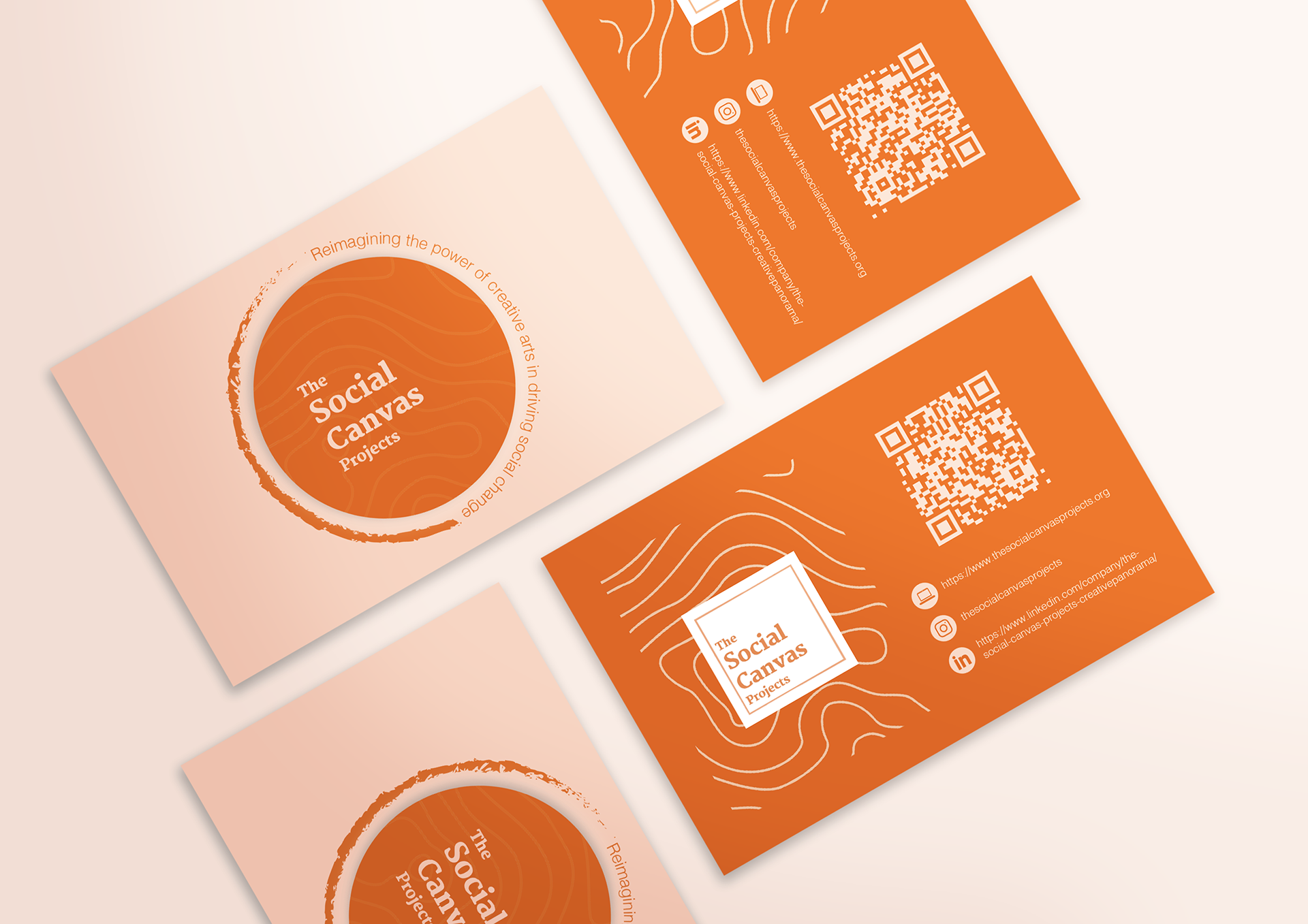
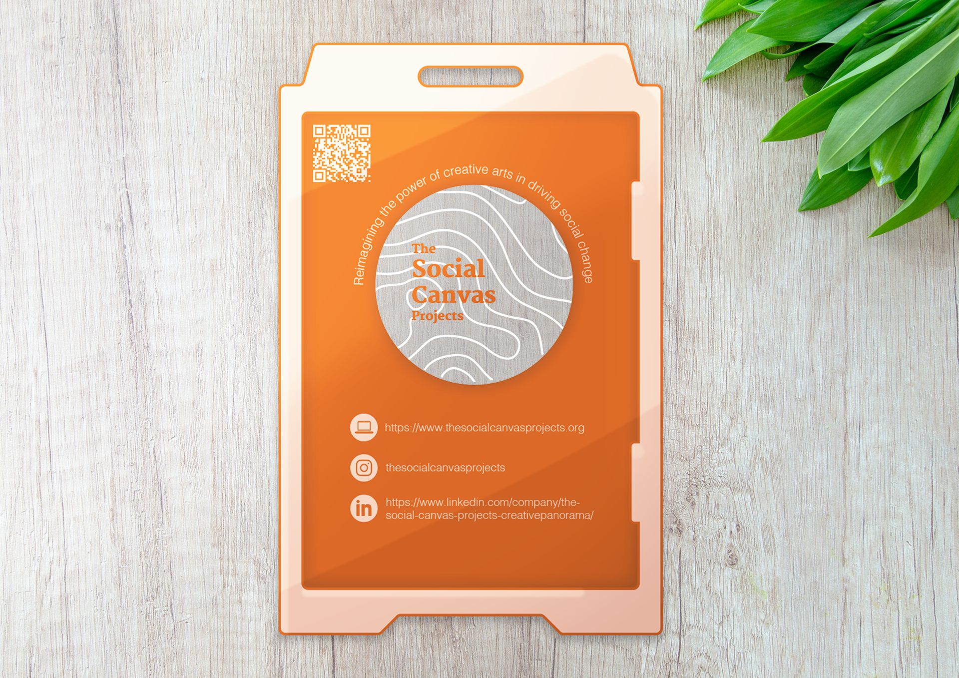
Business Card Design
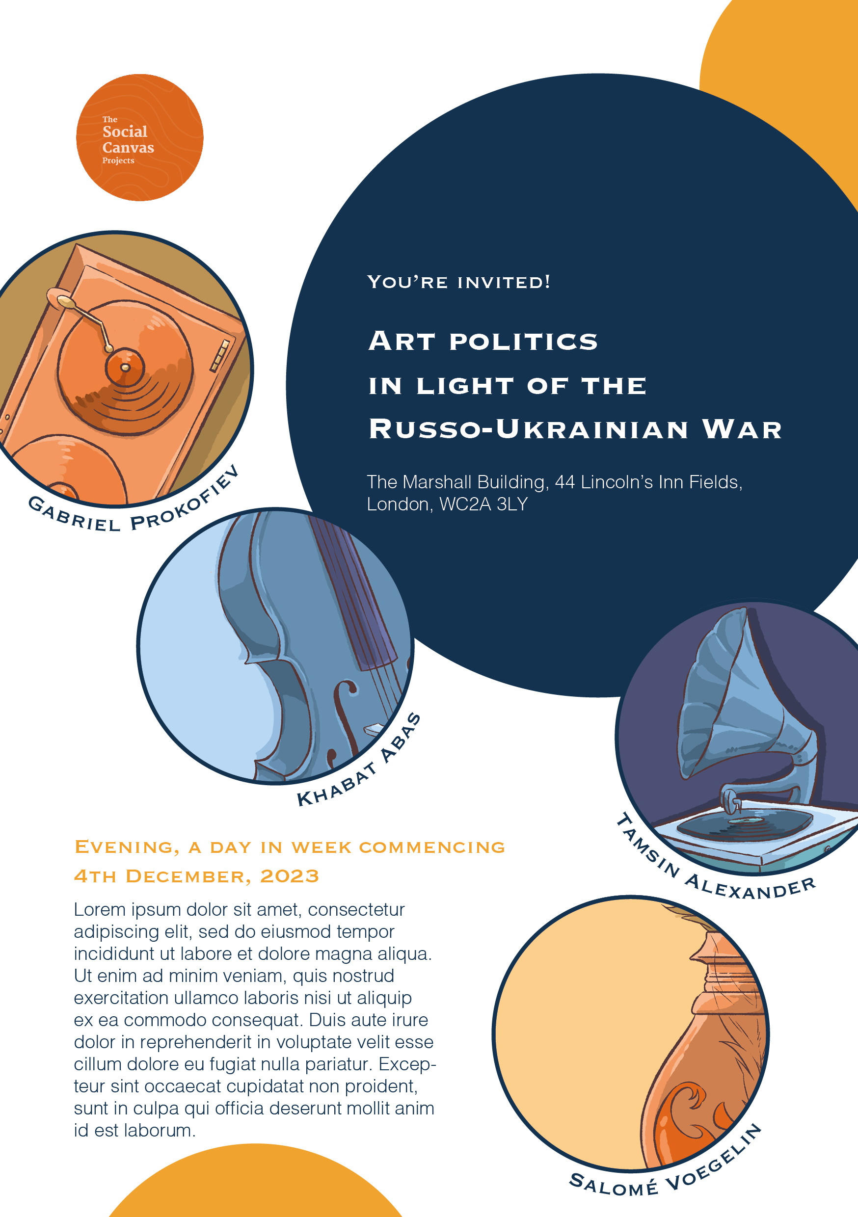
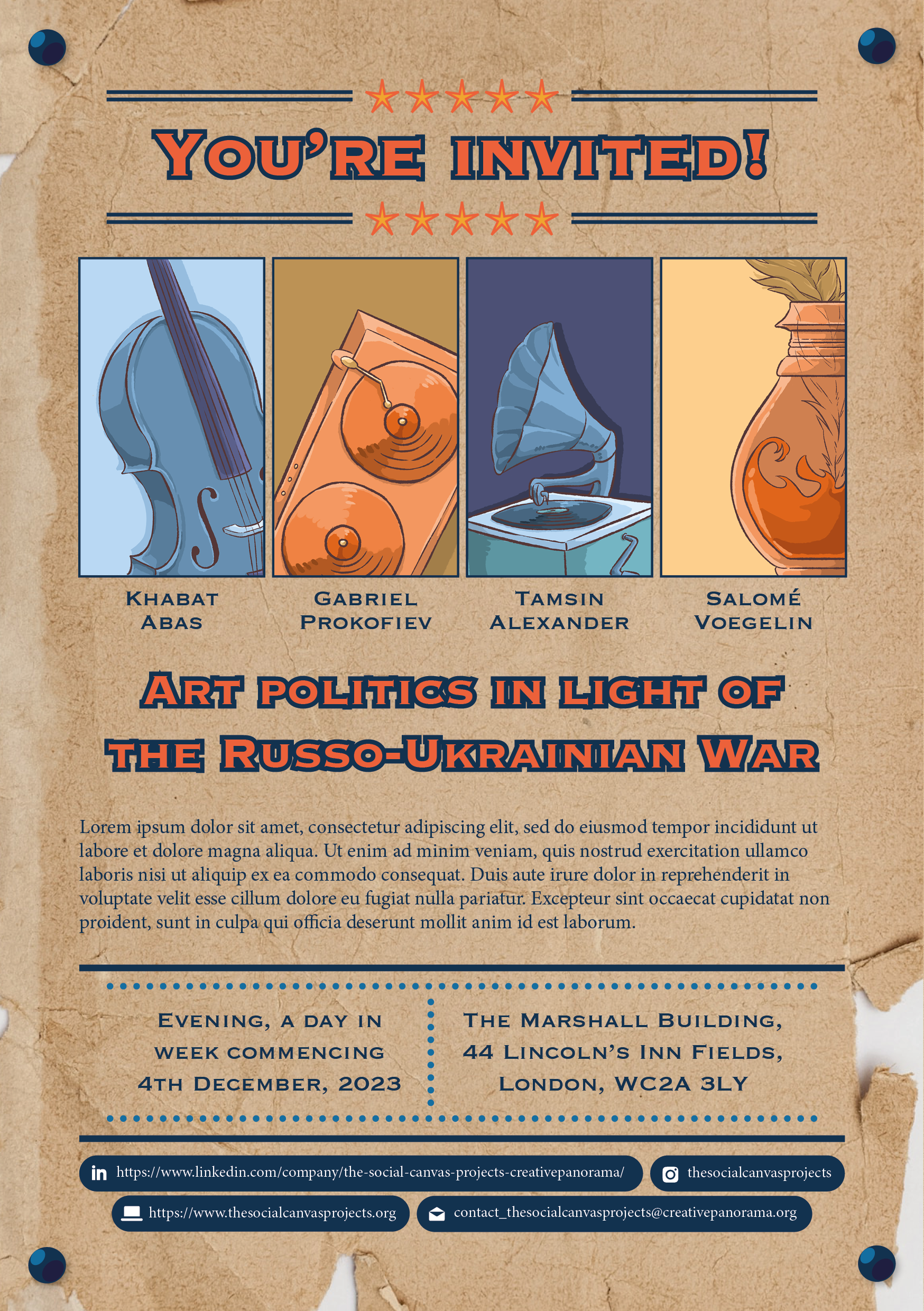
Invitation Poster Design
Logo Motion Graphic Design
The motion graphic designs showed the transition animation between the brand and the upcoming event logo design.
Hover Animation in the Homepage
To make the homepage look more interactive and interesting, I used the previous illustrations I created on Adobe Photoshop to create a motion graphic prototype on Adobe After Effects that shows the animation when users hover their mouse on user interface.
Thank You Card Design
The Thank You card design is for the special guests, who are going to perform for the upcoming music event, as a gift. Using the illustration asset I created, I used Adobe Illustrator and Adobe Photoshop to combine the illustrations with the card layout design.
Instagram Post Design
Since video content attracts more views and likes on Instagram, I have created a post layout design with a motion graphic element at the beginning. I used the action of taking photos as an inspiration and turned the square white containers as part of the camera. Using the blur visual effect and wiggle effect, I mimicked the process of focusing the lens in photography.
Presentation Slide Layout Design
Using Adobe InDesign and the previous illustration I created, I build a presentation slide layout design for the talk panel in the upcoming event, based on the theme color of the brand, blue and orange.
Mobile Version of the Website UI Design

Home Page
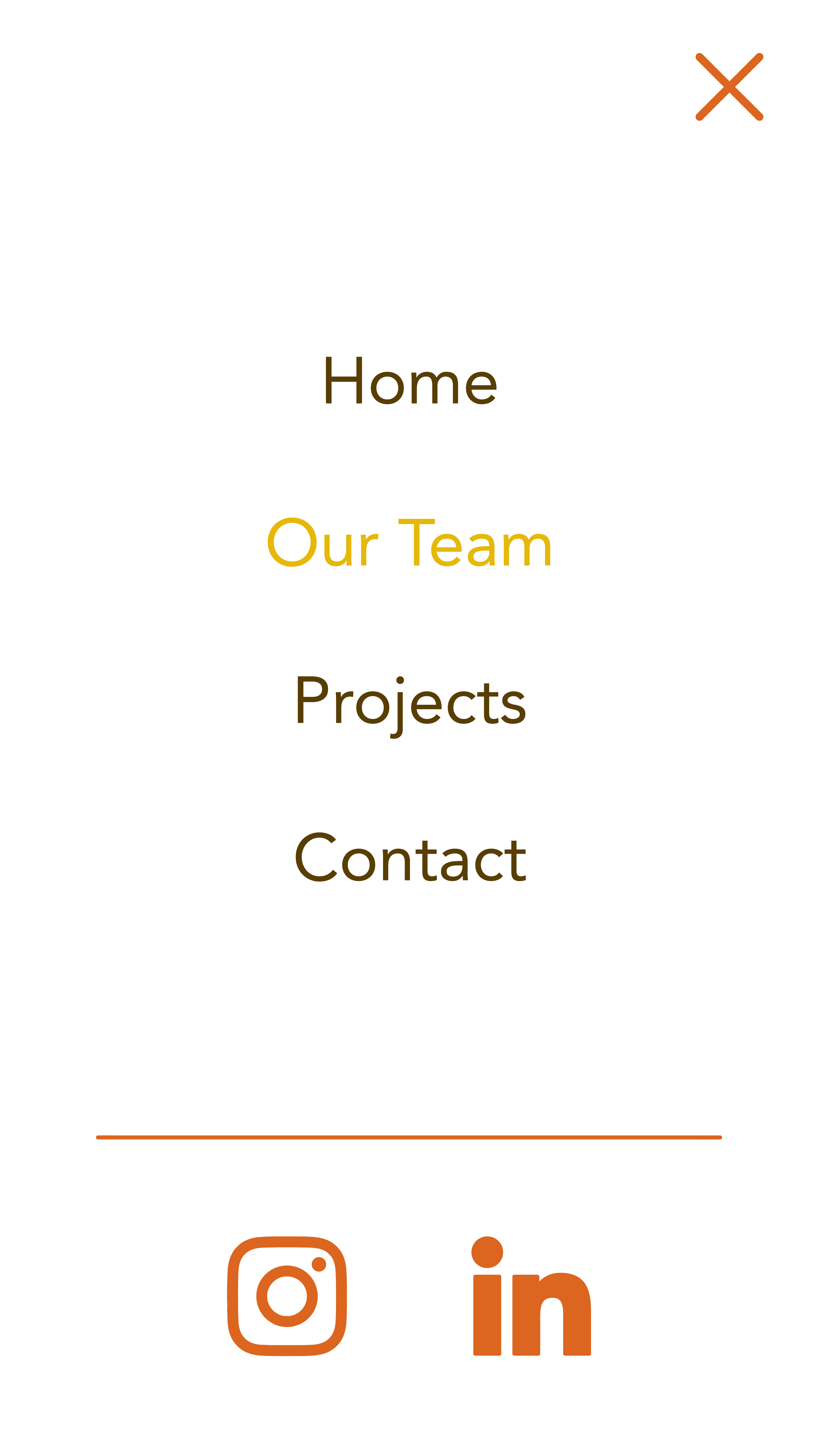
Menu Page

Our Team Page
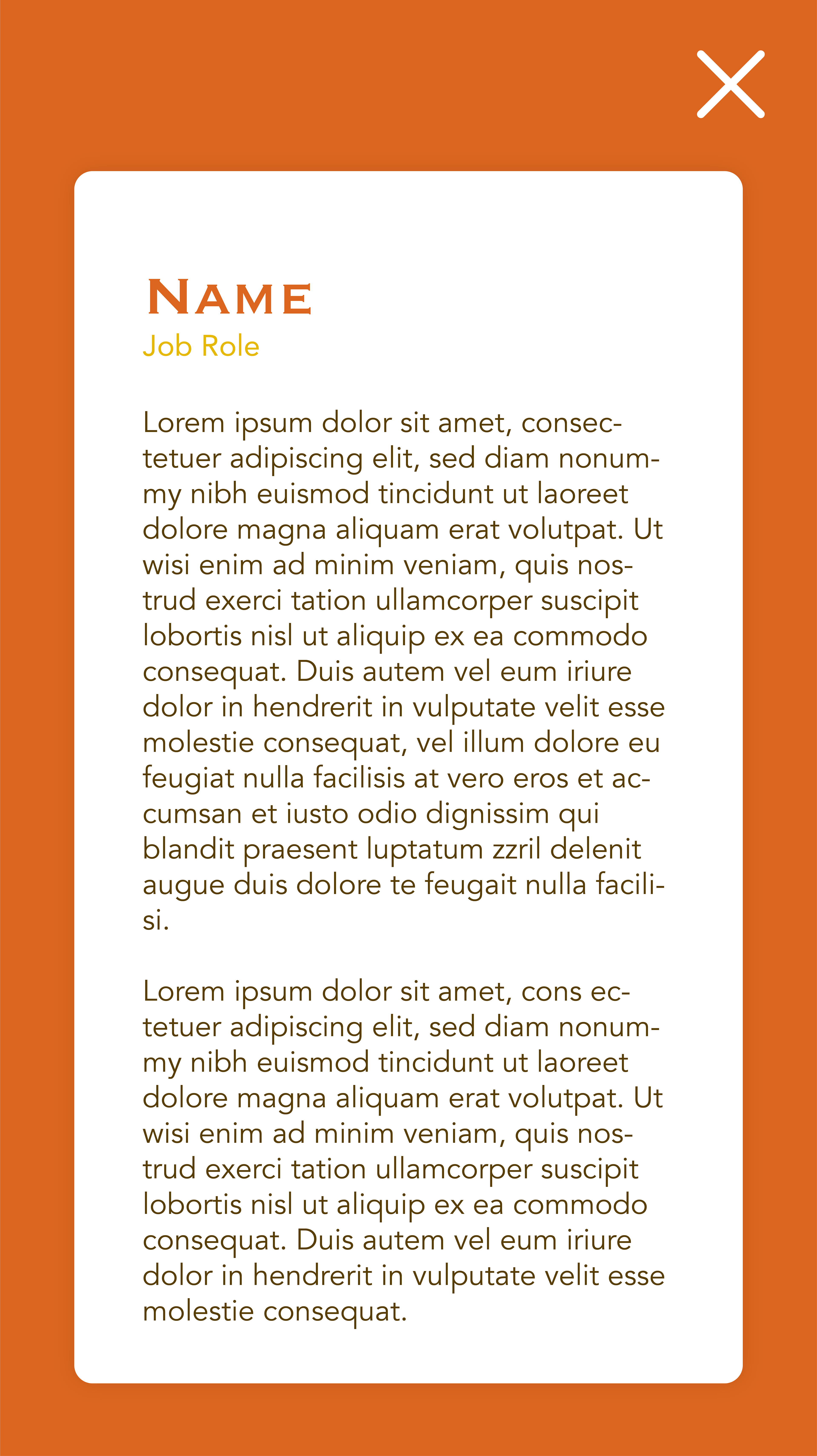
Description of the Member Page
With the UI design, I used the main orange colour tone of the logo, and the brown and yellow colour in the original website of the Social Canvas Project to create the mobile version of it. Also, I used the landscape pattern asset used consistently in the previous logo and website design. For the art style, I tried to keep it simple and graphic-based. To fit the brand guidelines and positive, fun, creative and young vibe of the brand, I used rounded corners for most of the text containers with drop shadow, like boxes that contain the photo and information of our members on Our Team Page.
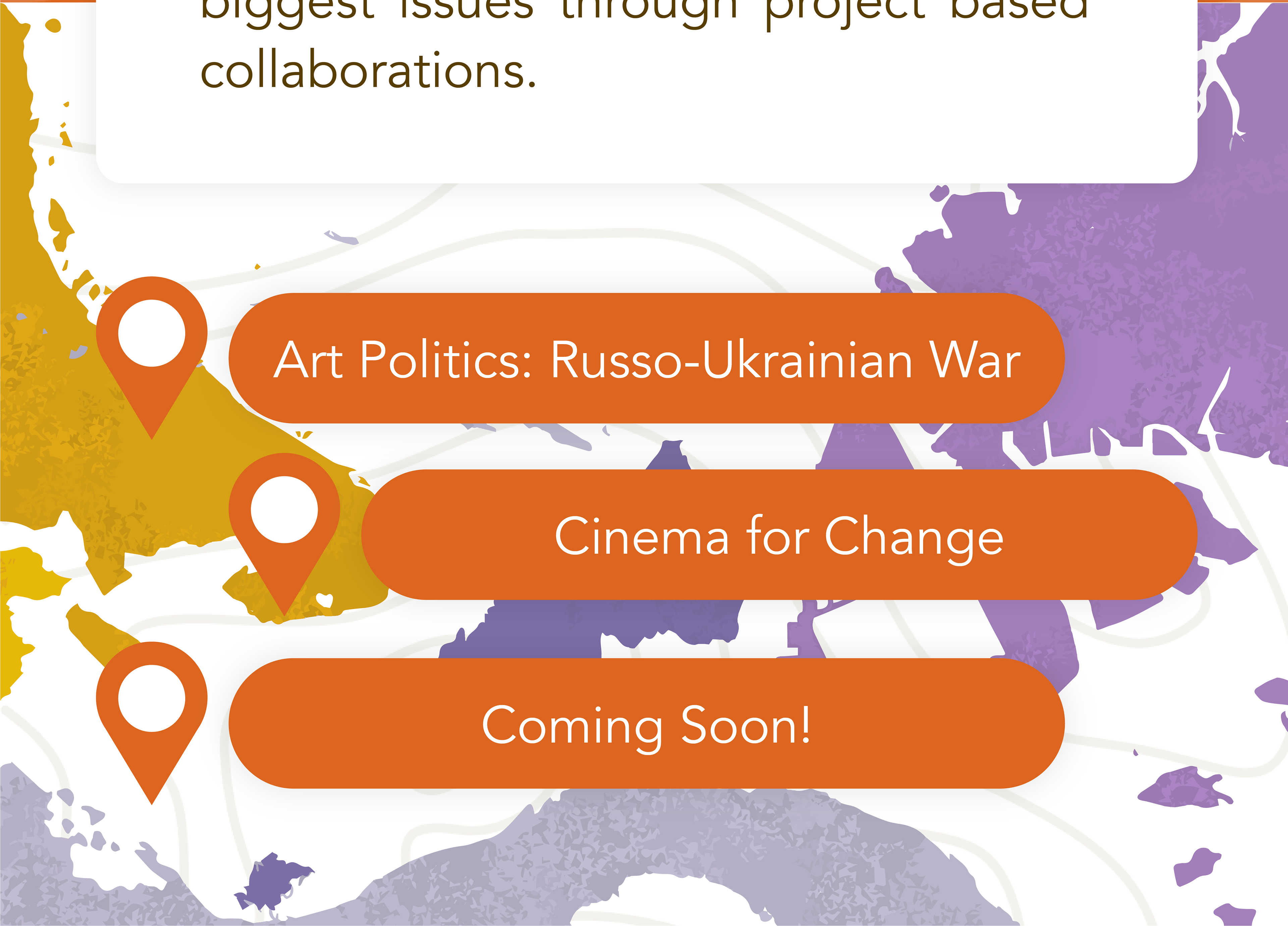
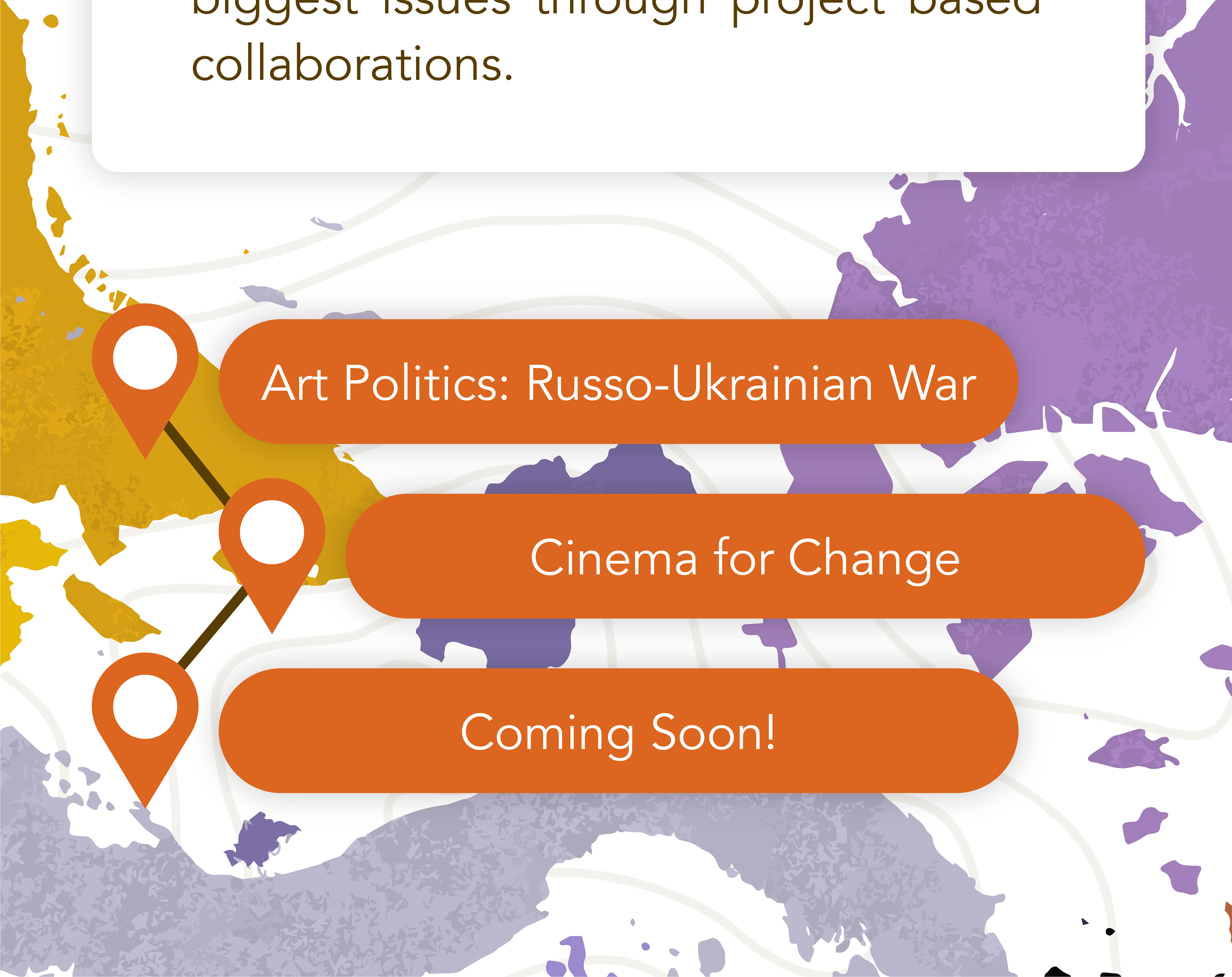
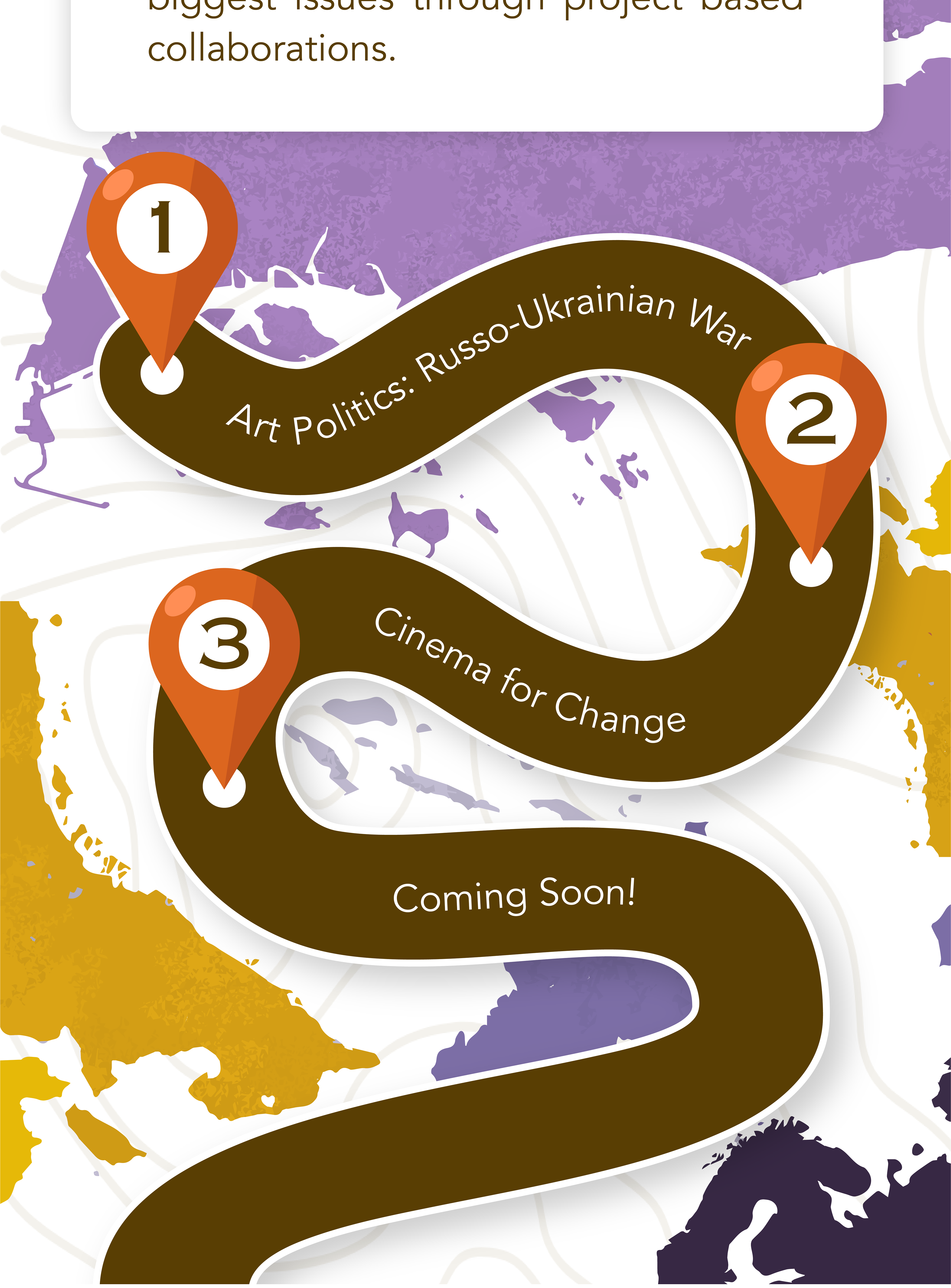
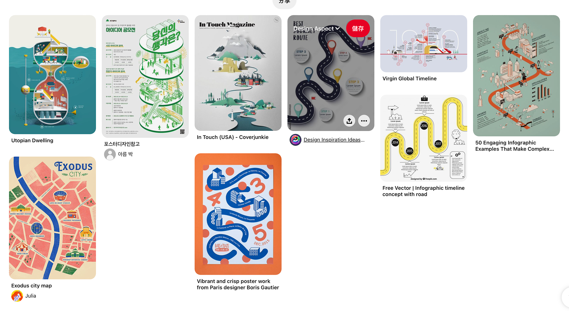
For the events listing design, I tried to use a map as an inspiration to showcase the event or panel that we are going to have. At first, I just used the simple method of listing the buttons mixed with the graphics related to map and navigation. However, my client wants a design that fits the vertical mobile UI design better as the references are shown next to the final version of it. So I combined the thick curly line blue and orange design with my art style to make the UI seem more interesting and match our brand vibe. Besides, I tried to add more lighting and shading to the orange navigation graphics to make it more solid.
Website UI Design
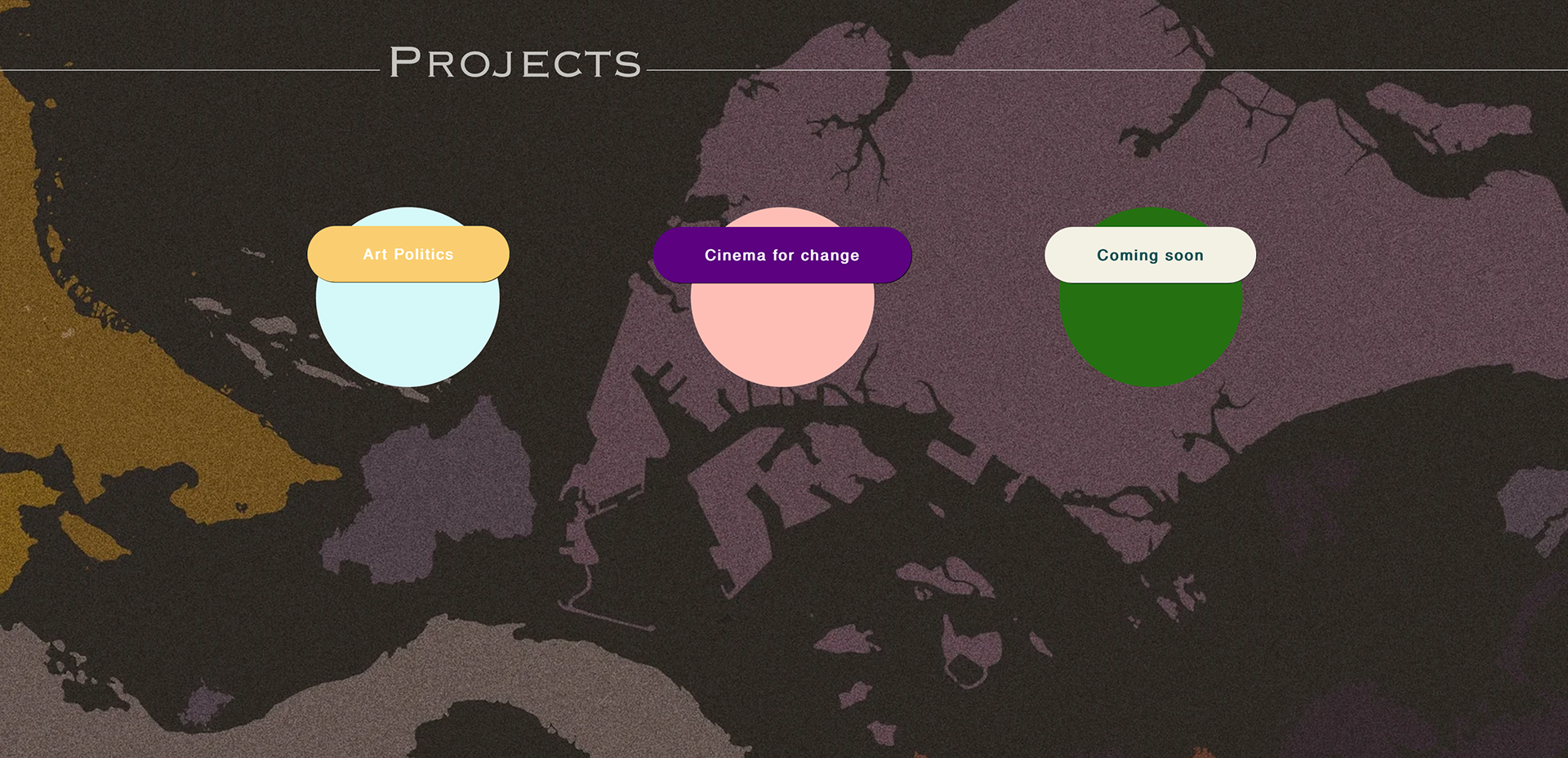
First Version
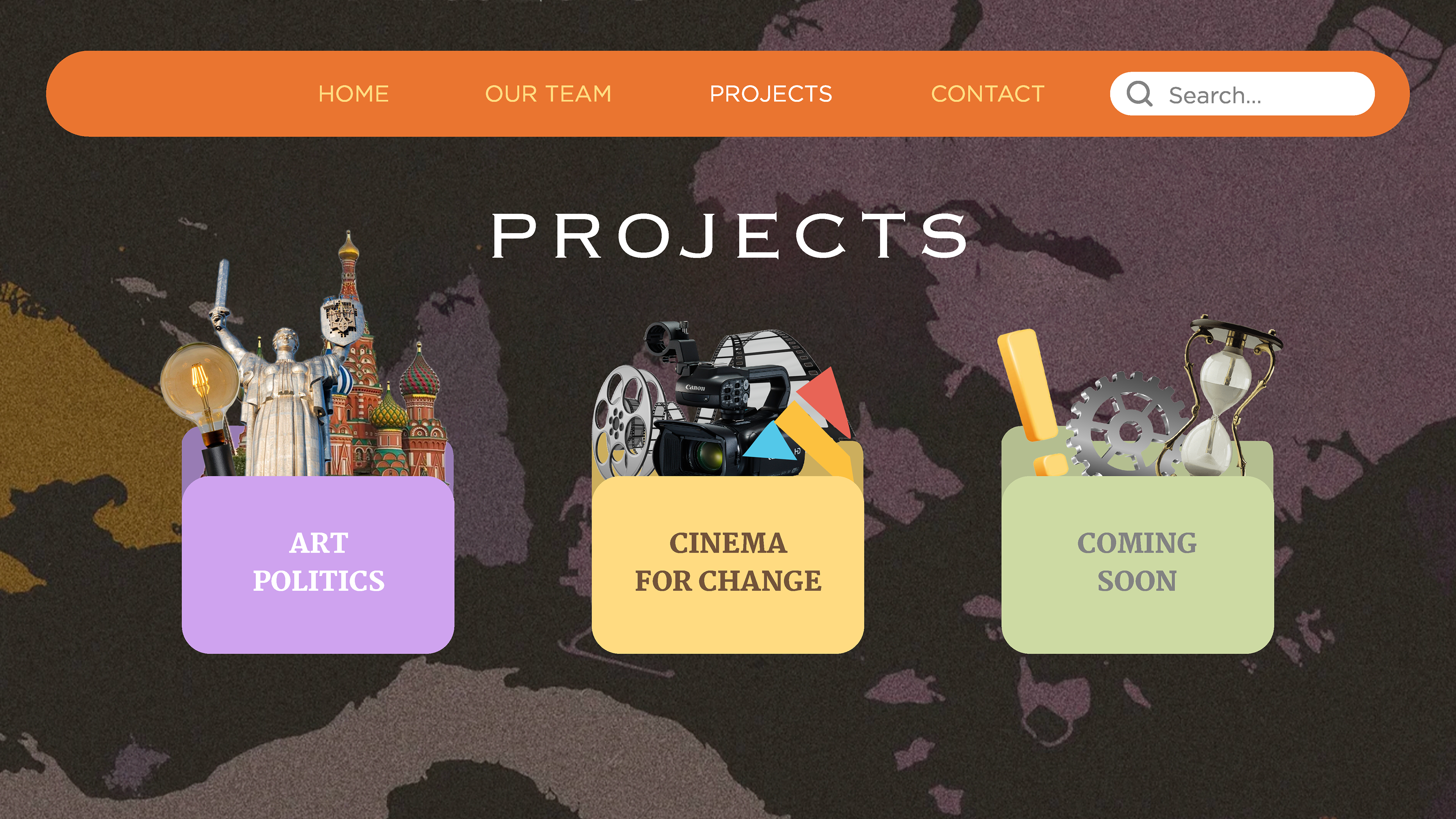
Second Version
My Version
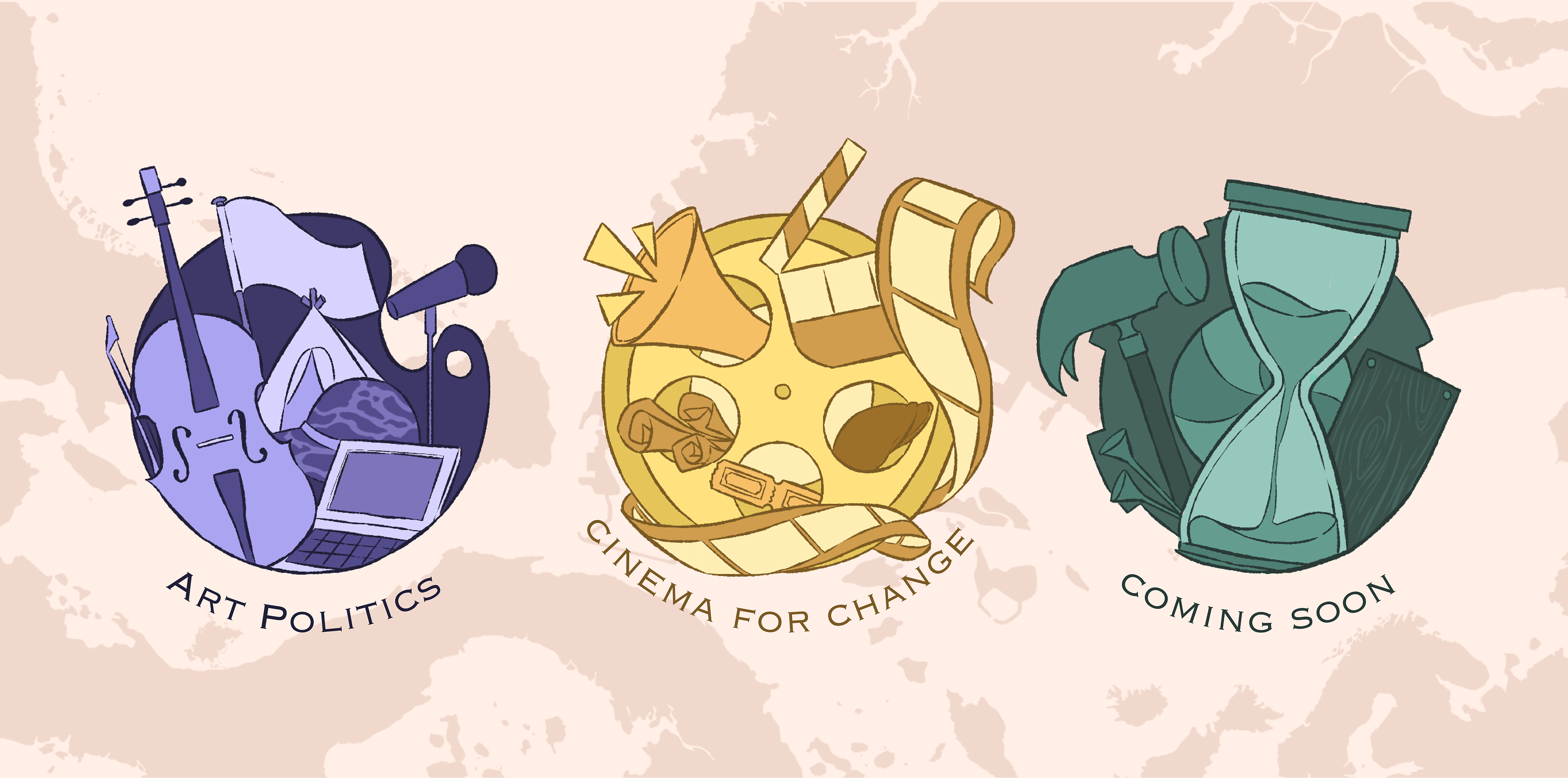
In the first version created by the leader of the design team, the design used the coloured circle as the button to the page of the event's information. Then, one of our team members created a second version with event-related visual elements in a folder for each project, such as tickets and film tape in the Cinema For Change. I combined these elements by adjusting the colour choices and art styles to reduce the messiness of being too colourful, so I decided to use only one main colour tone for each icon and pale pink for the background.
Digital Hand-drawn Illustration Asset
Using Adobe Photoshop, I created an illustration asset for The Social Canvas Project, which may used on future social media posts and other graphic designs.
Stage Design
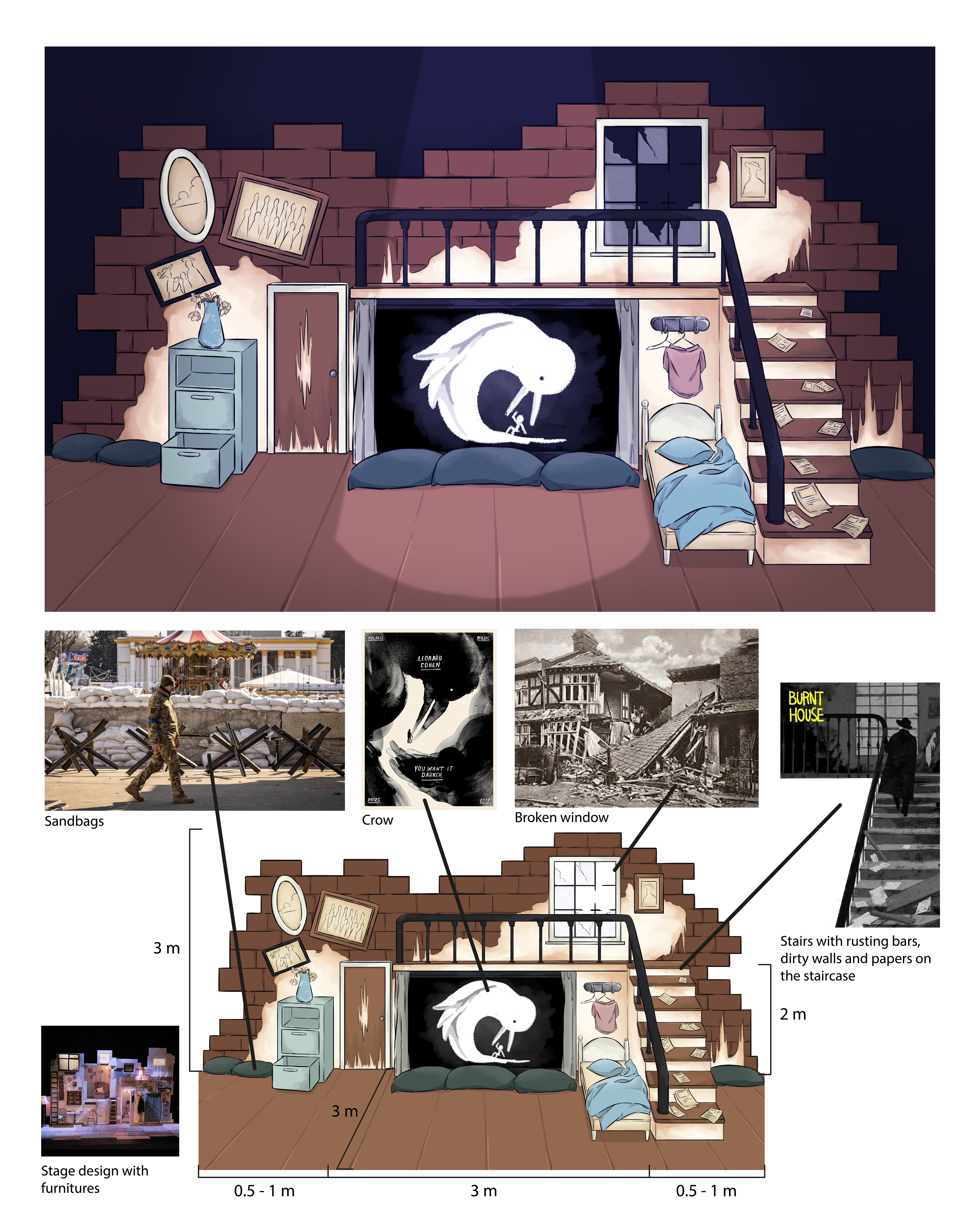
First Draft of the Stage Design
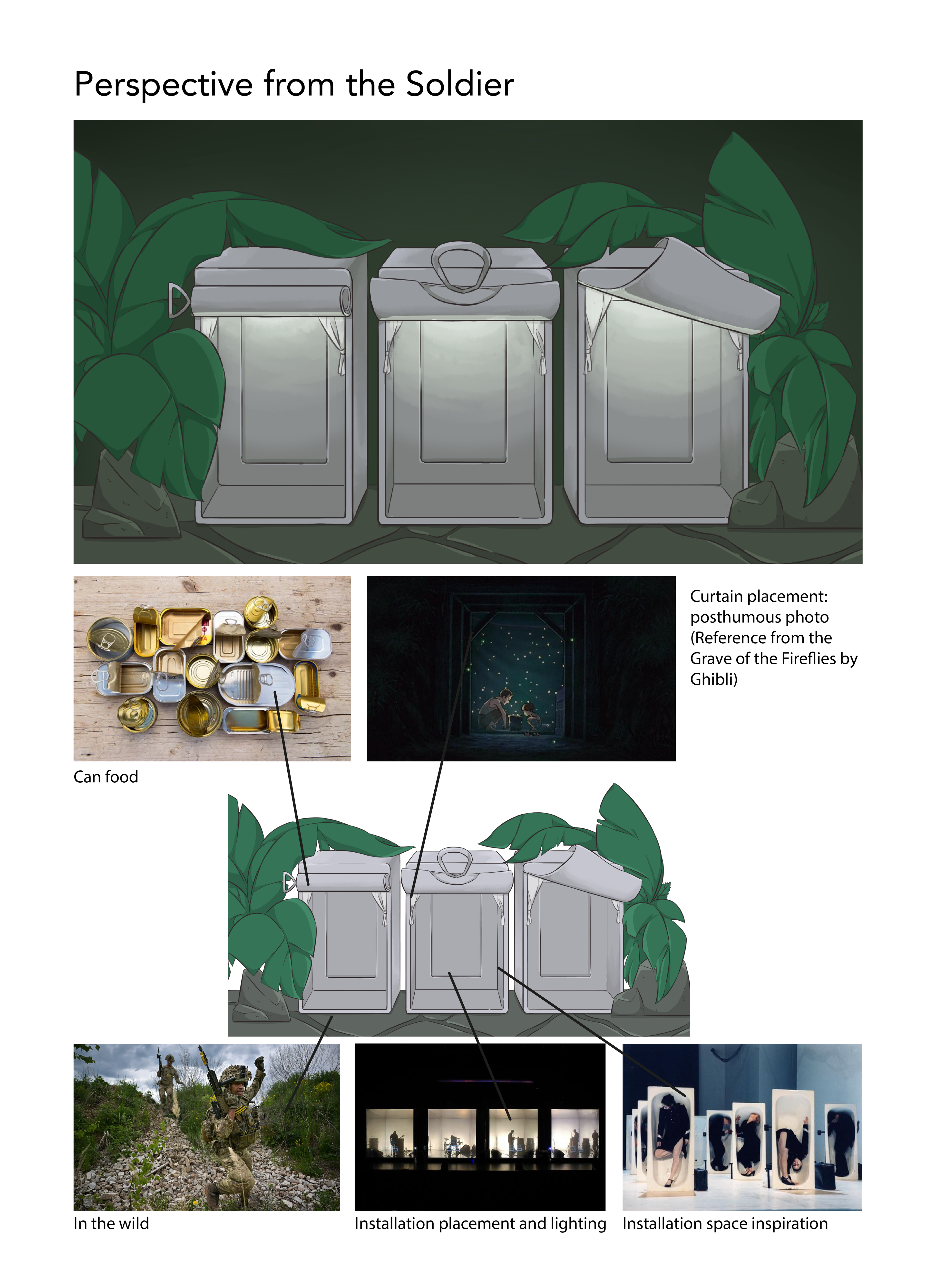
Second Draft of the Stage Design
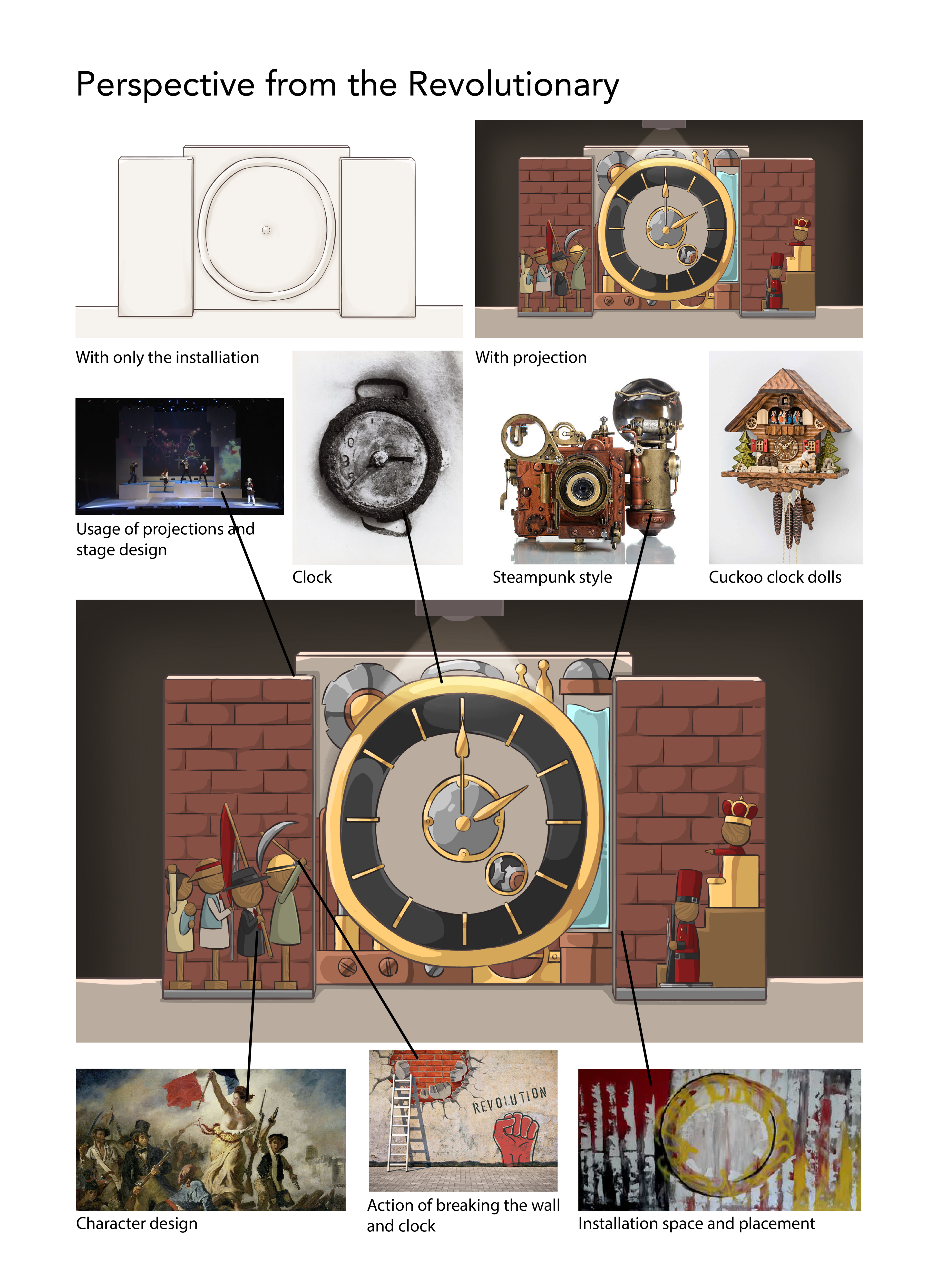
Third Draft of the Stage Design
For the event, we're going to have guests perform music about the theme of war and conflict, for example using the wood planks burnt from a war to create a cello and play it on stage. The design team decided to use dark, blue or green lighting to create a fearful feeling and environment to fit the theme.
In the stage design, I created three versions according to three perspectives about the topic. One of them is victims and civilians suffering because of wars. I used the photo and painting of broken houses as references to create a replica of the interior of those houses with an animation playing in the middle of the screen. The animation will be about a tale that a human who turns into a crow and consumes his friend. For the second draft, I used the perspective and first impression of the soldier, who is usually working in the wild and eating canned food. So I used the concept of having three can-shaped installations for the performers to stand in. In the third draft, I used a more positive approach and focused on the revolution part and the reason for the conflict, which using mainly projection as the media and the cuckoo clock as an inspiration to show the wooden dolls fighting for equality with the royalty.
Audience and Event Experience Design
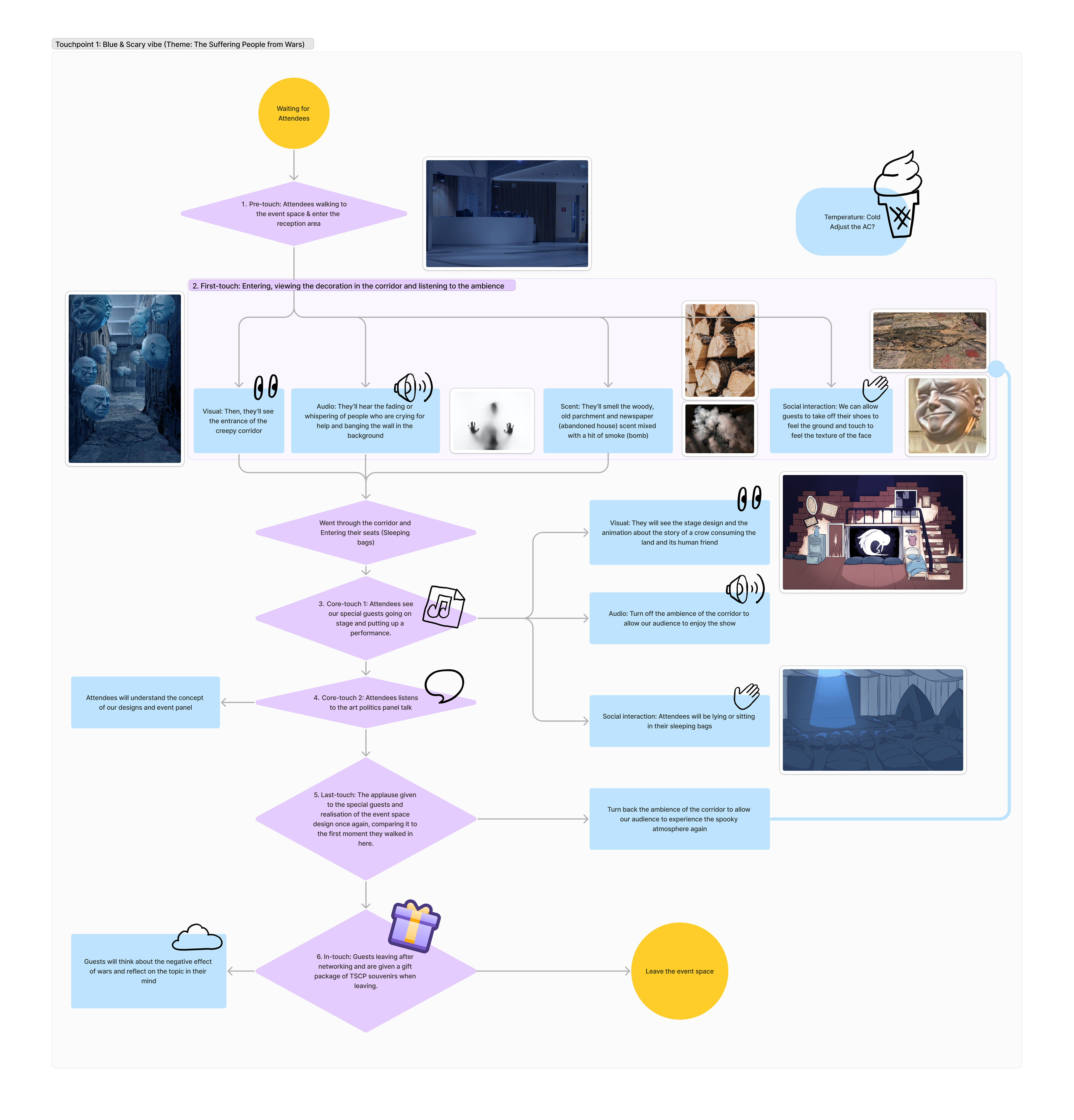
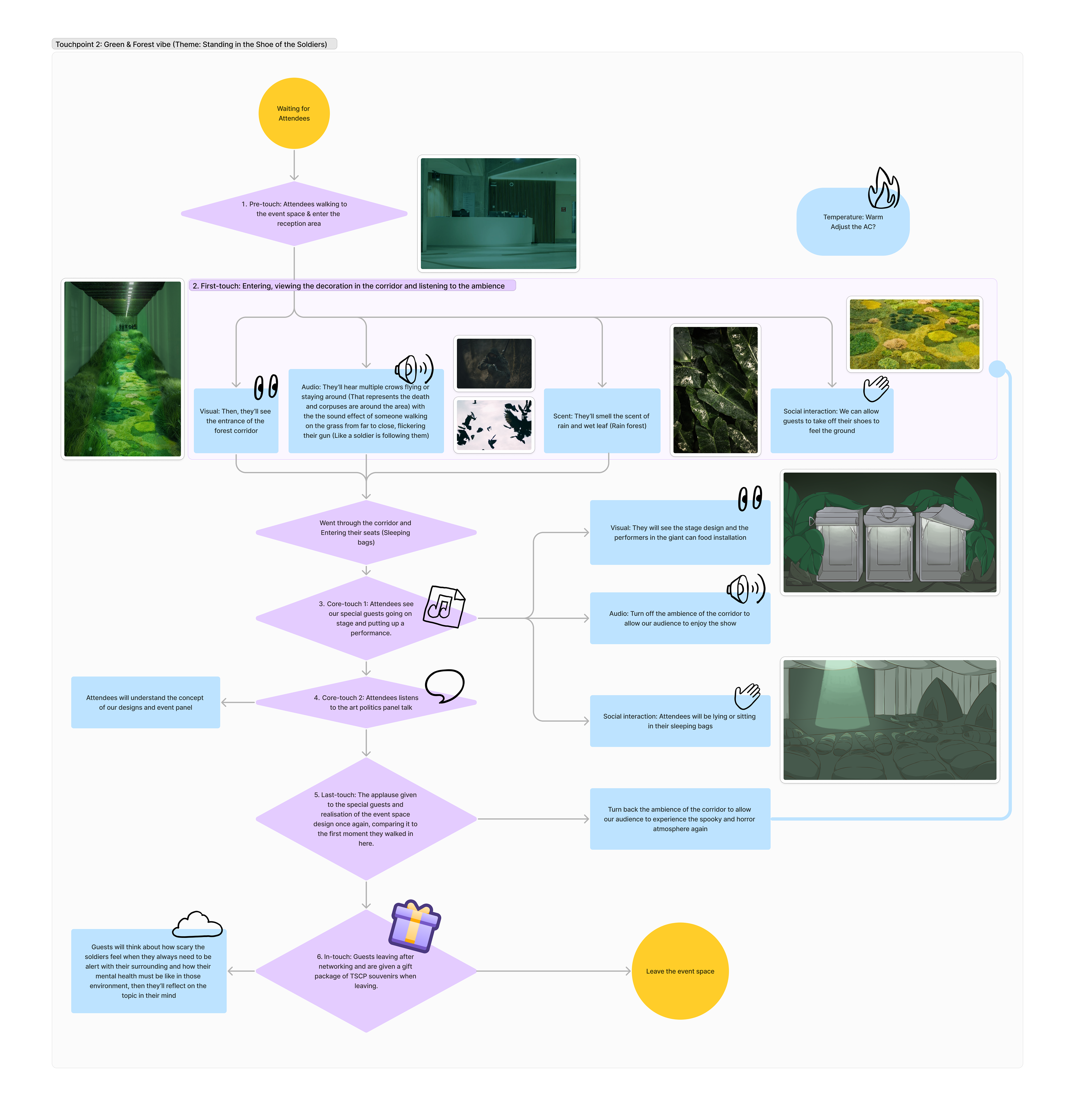
Here are the two versions of touchpoint flowcharts built-in Figma, which showcased the audience experience from entering the event space to leaving it after viewing our music show and panel talk. And I used the corridor design and stage design I created previously as a base to create two themes. One of them is about the suffering civilians of war and the other one is about the soldiers.
Final Event of the Art Politics in light of the Russo-Ukrainian War
Opened Leaflet
Closed Leaflet
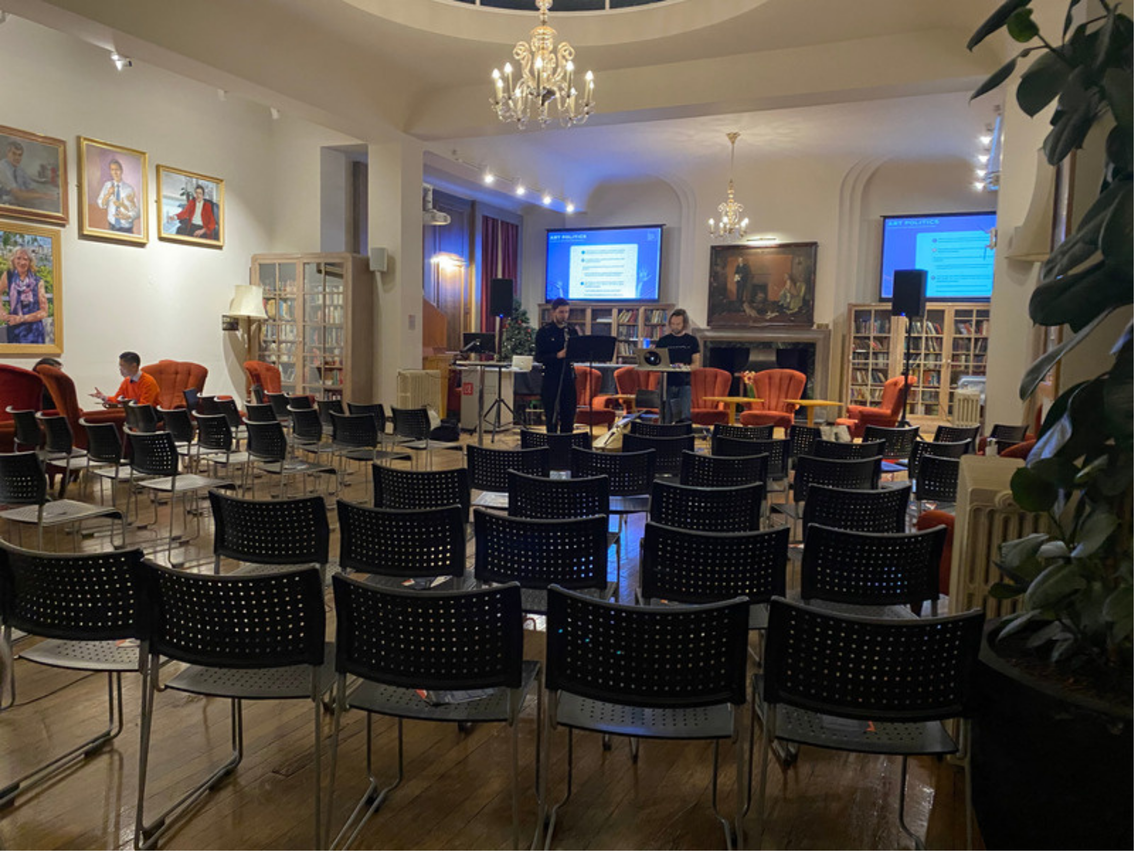
Event Space: During Rehearsing
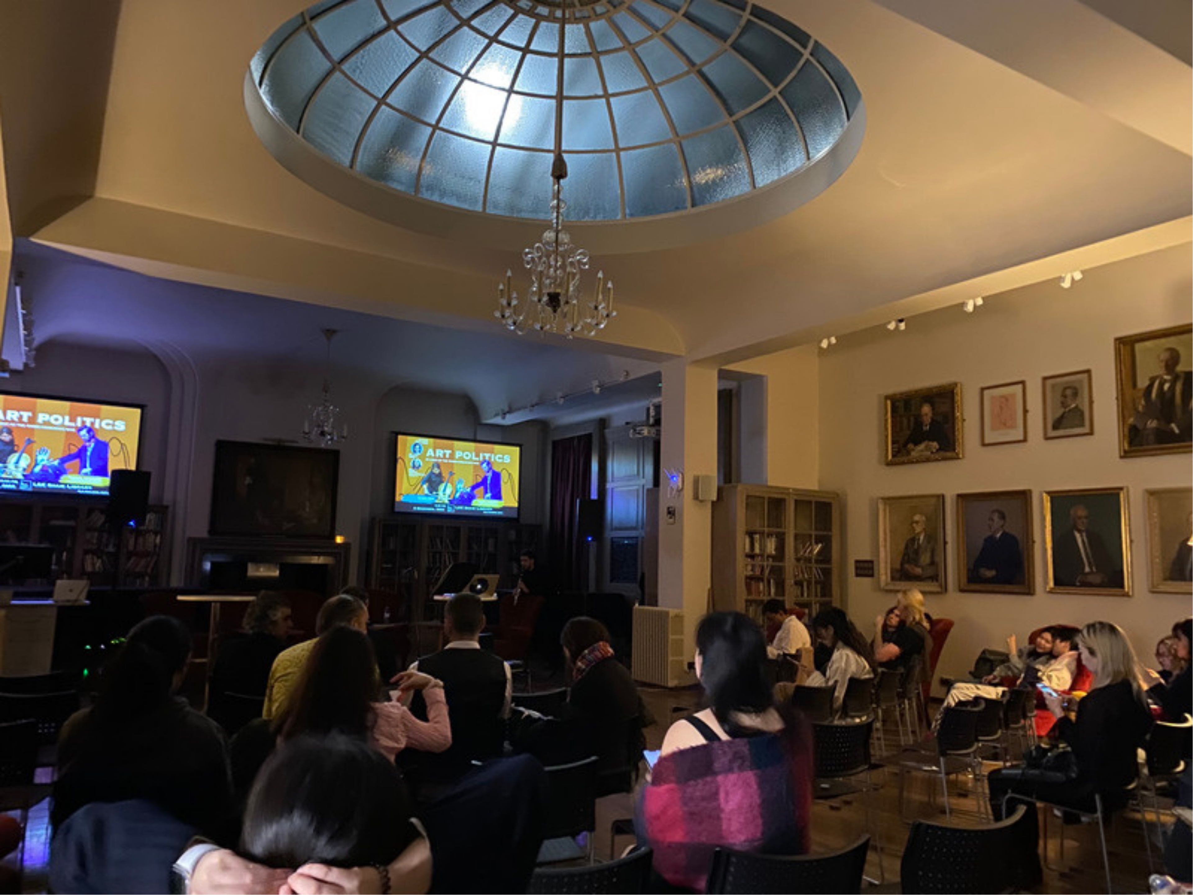
Event Space: Opened for the Public
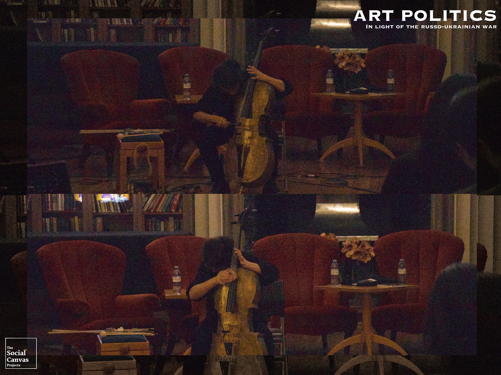
Event Space: During Performance
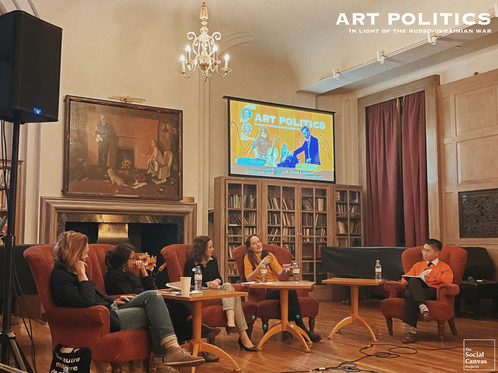
Event Space: During Talk Panel
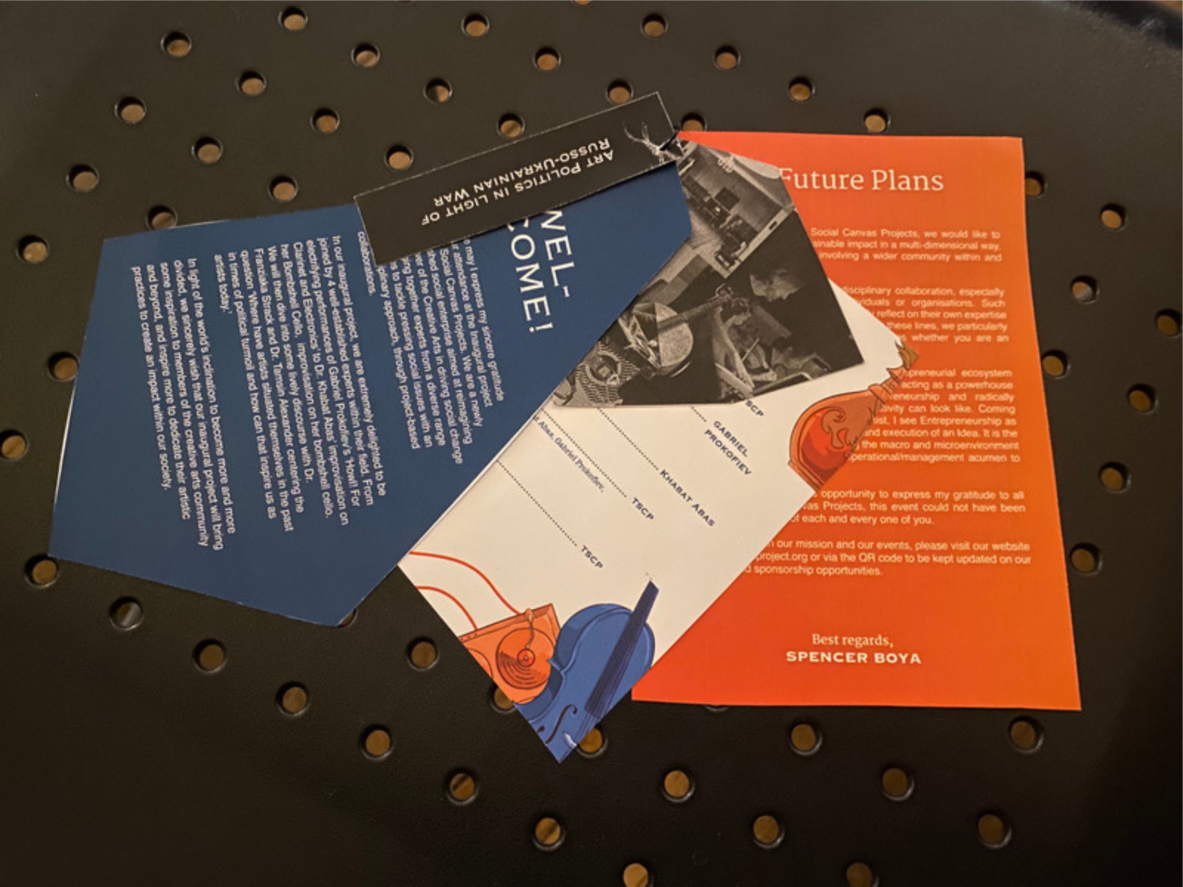
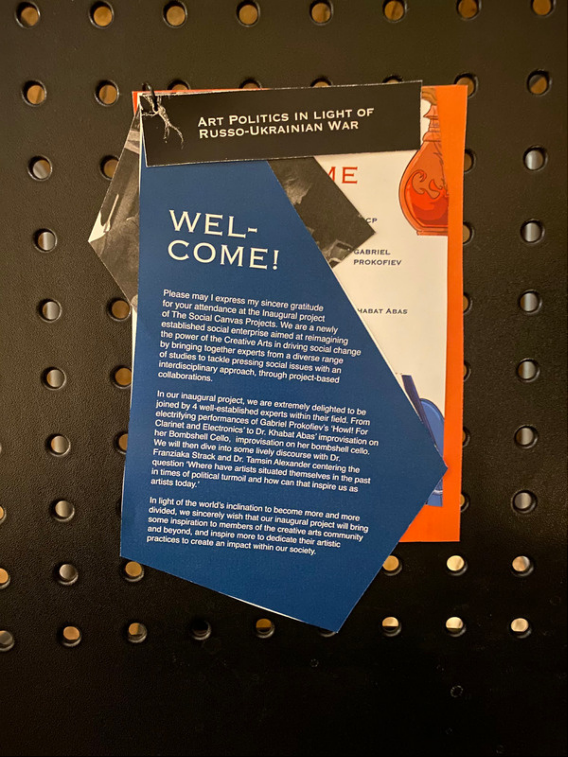
The 8th of December, it's the date of the event, Art Politics in the Light of the Russo-Ukrainian War. Before the event, we had to arrange the seats and prepare the physical leaflets and refreshments for the guests. For the design team, we had to cut out the printed pages of leaflets to their specific shape as shown in the picture, then punch the hole on the upper left to use a ring to combine them.
In the preparation and operation of the event, I learnt more about the importance of event planning and paying attention to details in the non-design related aspect, like consideration of the needs of the guests and rules of the event space. I hope that this experience and knowledge will help me to succeed in my future career.
