In this non-profit design project "William Blake and Conflict Beyond Borders" operated by The Social Canvas Project, I'm responsible for developing graphics design, motion graphic contents and print design on Adobe Creative Suite, such as poster design, leaflet design, Instagram post design, programme design and 2 motion graphic teasers for "Academic perspectives on blake" and "Relief Etching Printmaking Workshop, Zine Fair & Photo Booth".
Mood-broad & Research
During the research about William Blake's works, I found that he did illustrations for his and others' poems. Which, he used a lot of nature elements, like vines and trees. His art style sometimes has a specific touch of using sharp and curly shapes for drawing fire, trees and flower petals. So I'm going to apply these features in my poster design.
Draft Version of Poster Design in Week 1

Version 1 of the Poster Design
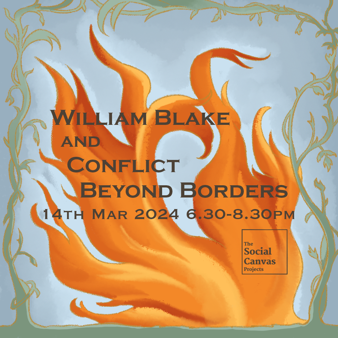
Version 2 of the Poster Design
In the first version, I used the tree in the illustration in the poem "Blossom" as a reference and our brand colour, orange to create this design. I also used a pale yellow colour, like the parchment used in the past as the background. In the second version, I used the nature element in some of his poems as a reference to create the frame of the poster, then I created a drawing of fire to represent the "conflict" in the title of the event.
Draft Version Event Poster Design in Week 2
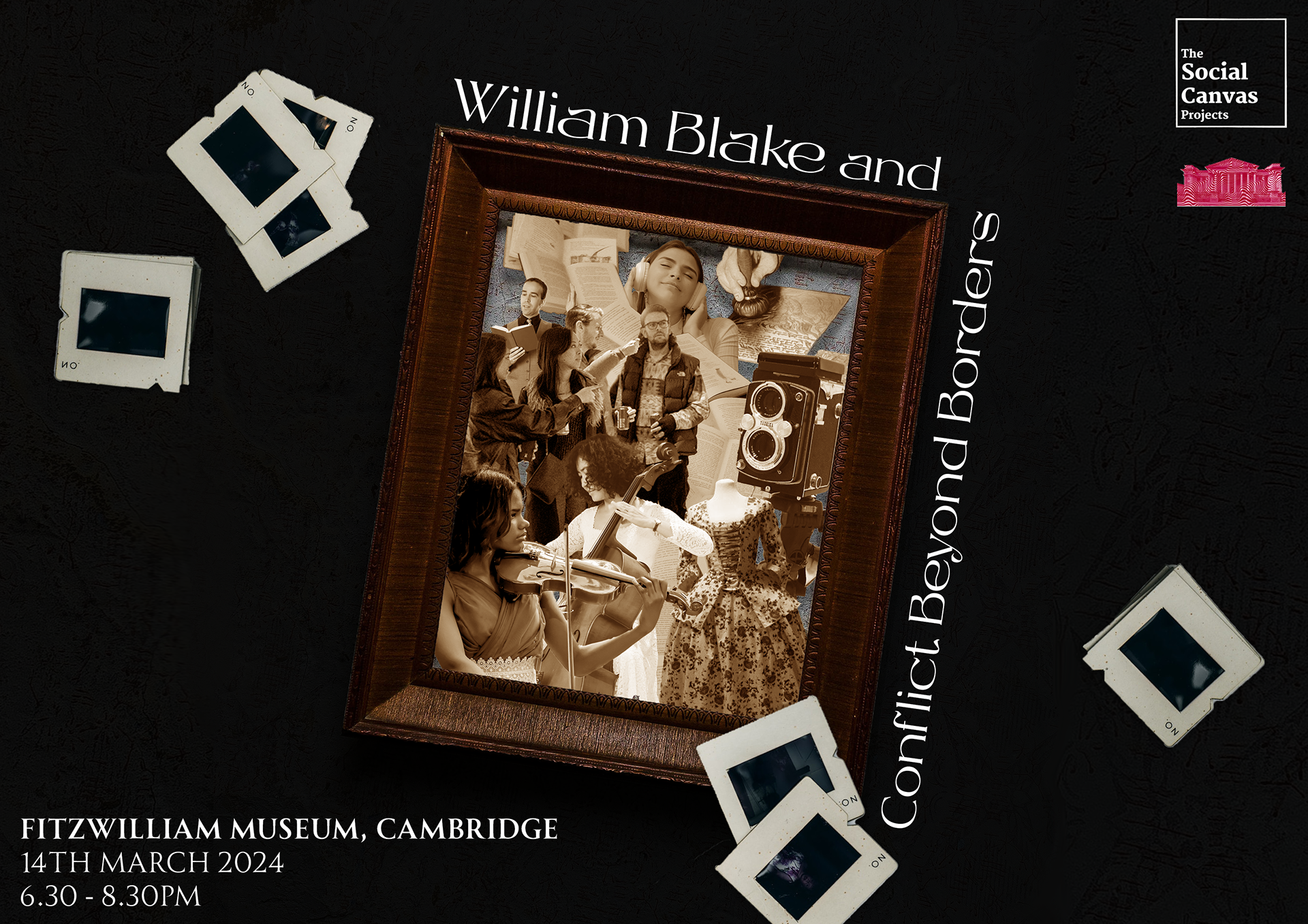
Landscape Version of Version 1 Event Poster Design
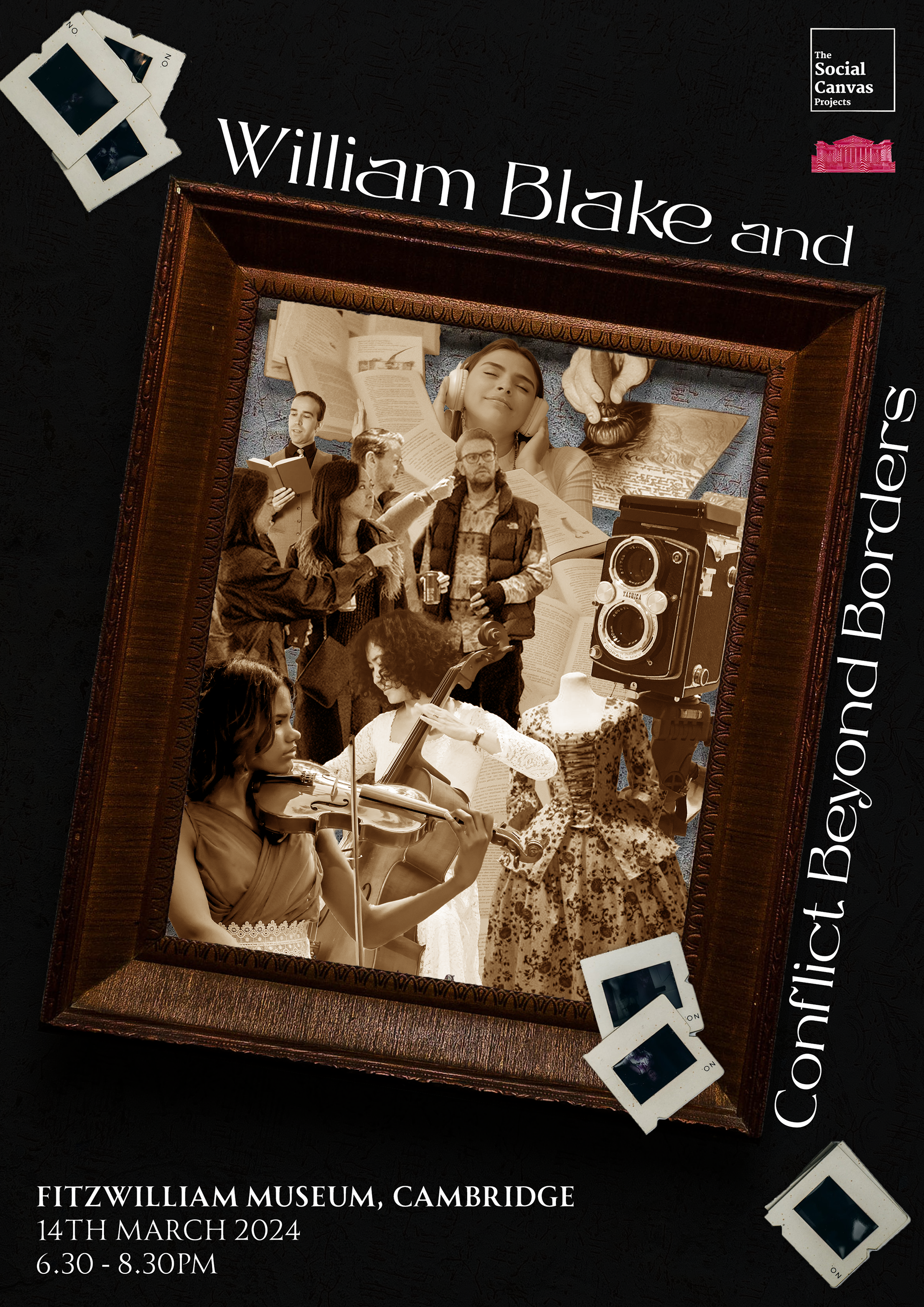
Square Version of Version 1 Event Poster Design
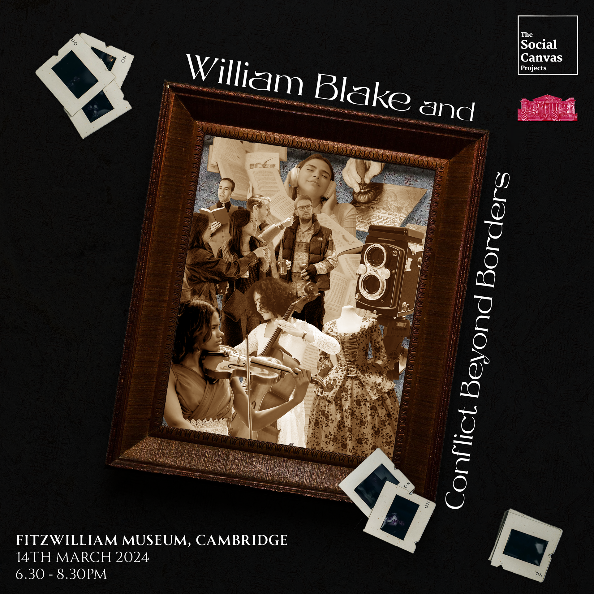
Portrait Version of Version 1 Event Poster Design
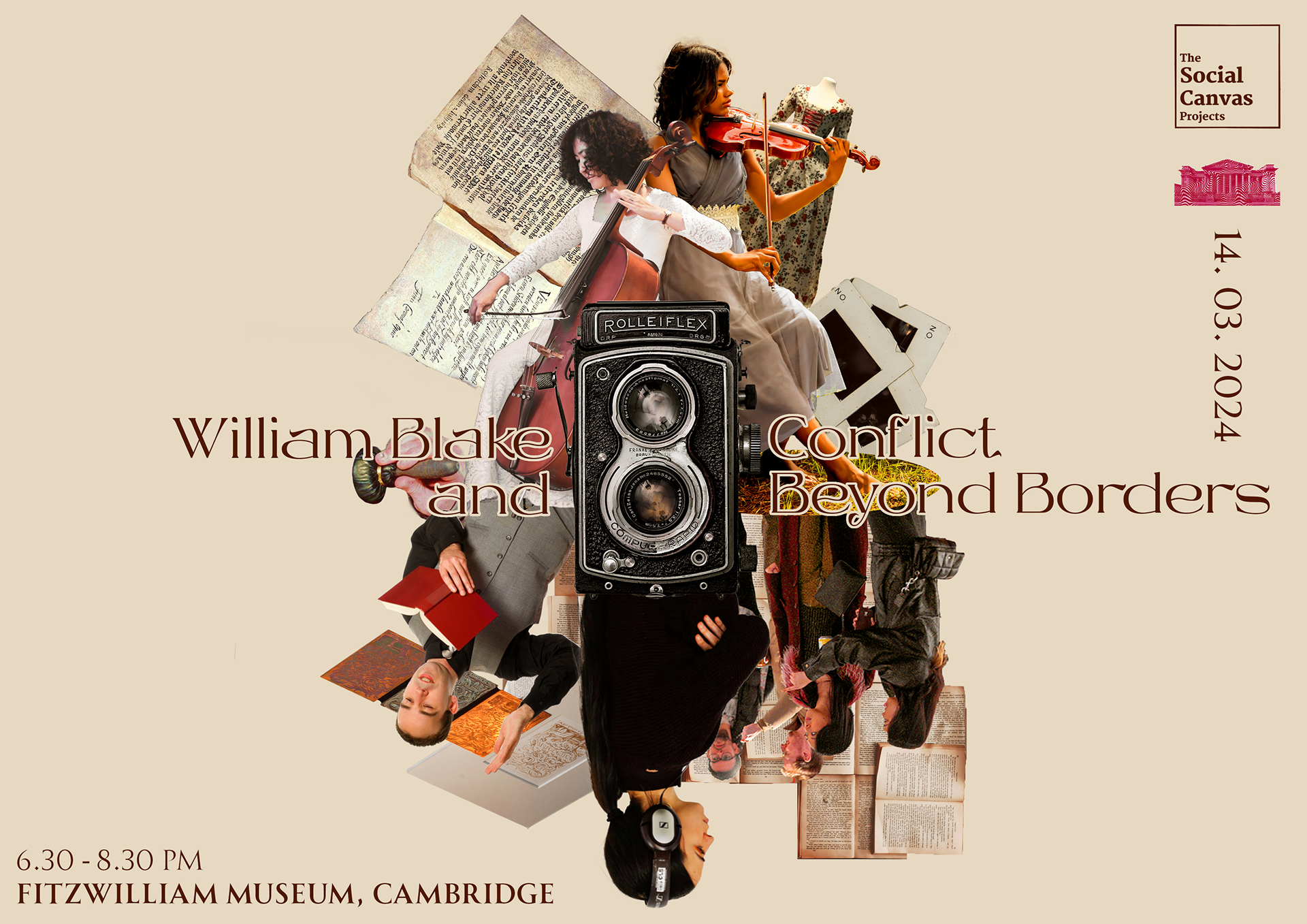
Landscape Version of Version 2 Event Poster Design
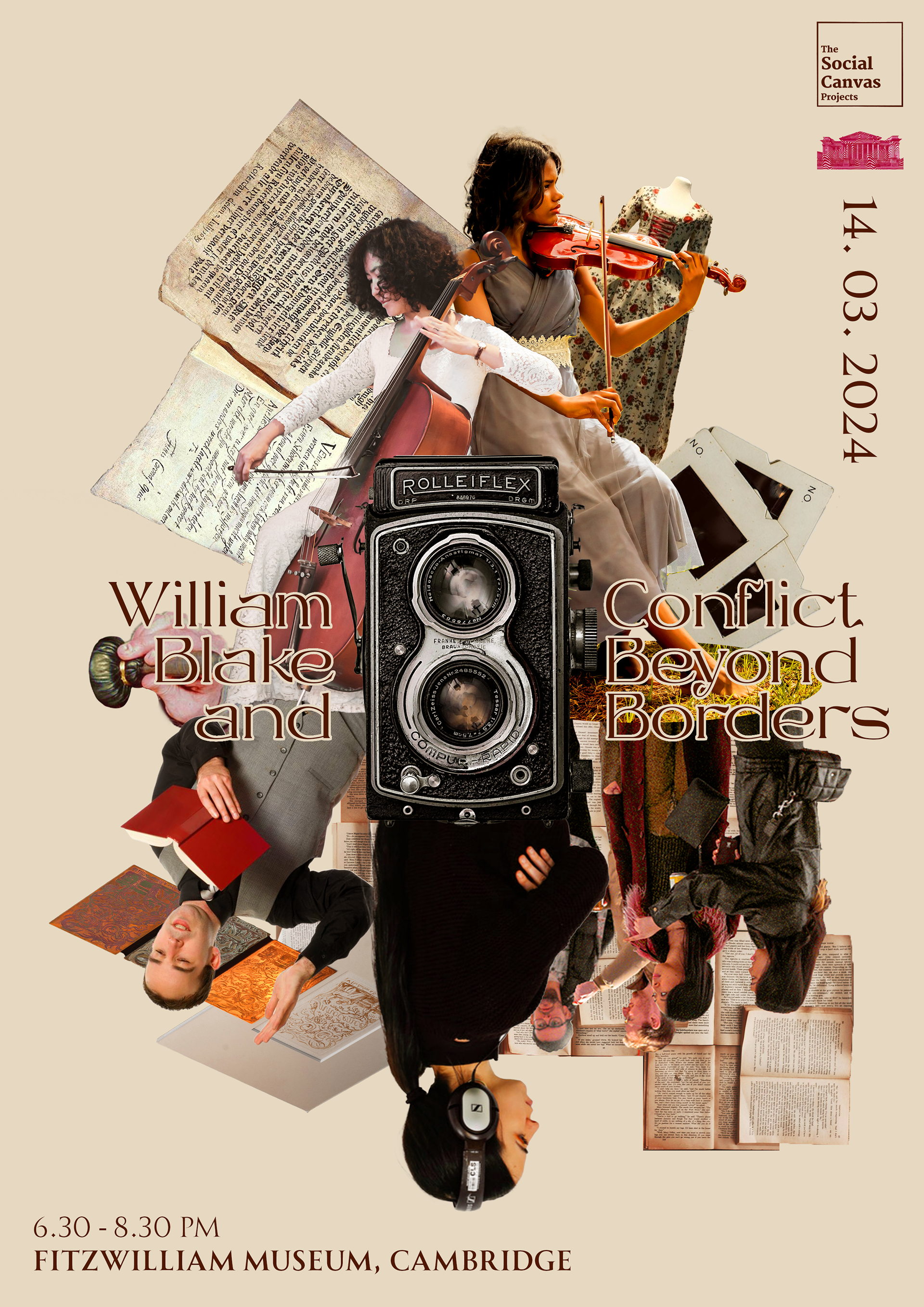
Square Version of Version 2 Event Poster Design
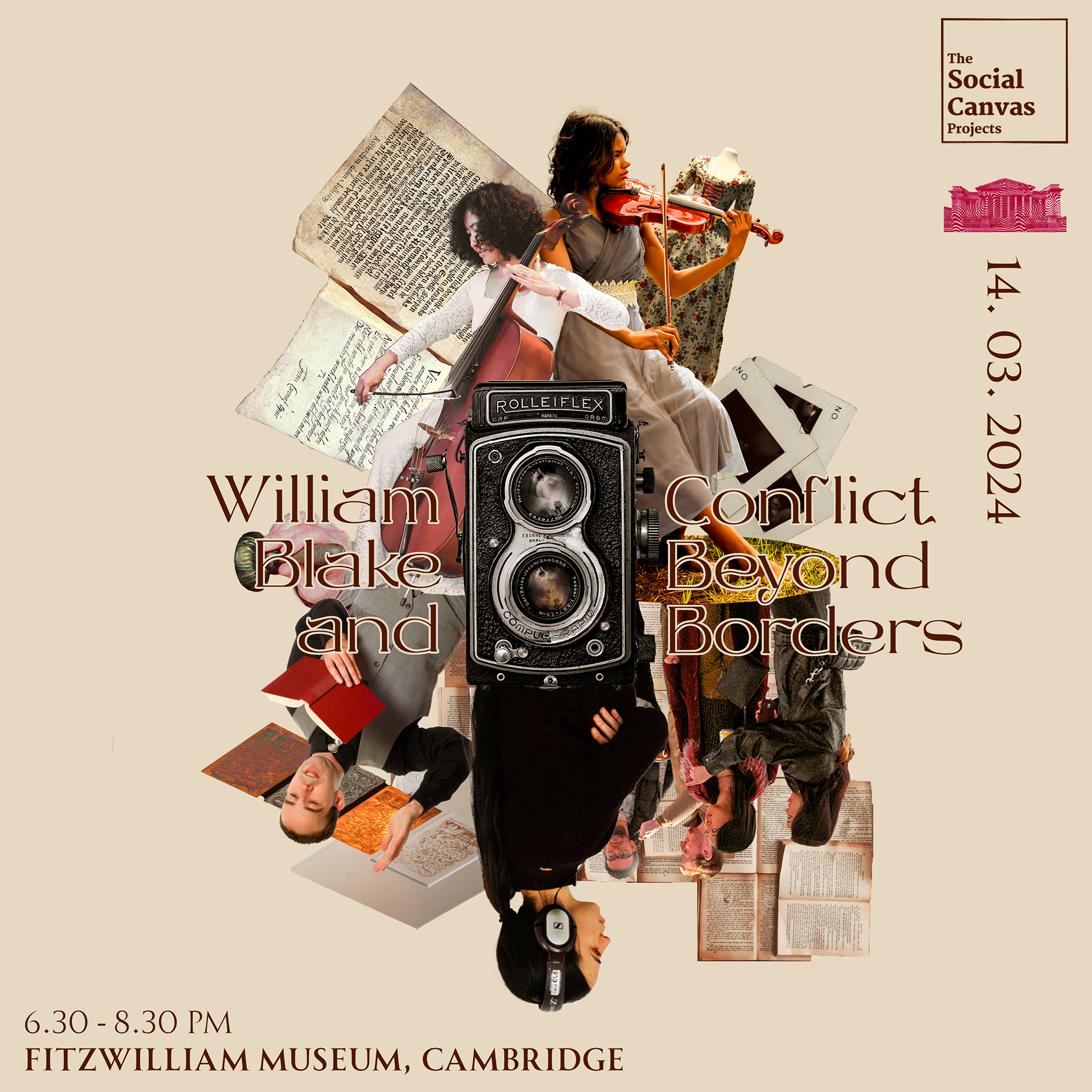
Portrait Version of Version 2 Event Poster Design
After the meeting, we finalised the art style, font and colour palette, which we mainly used the collage of photographs for all the designs. In this task, I'm required to create 3 sizes, including square, landscape and vertical for the social media and printed versions.
In the first version, I used a more vintage, dark and brown tone to showcase a variety of activities we're going to have at the event, like photo-booth, print-making workshop, musical show and poetry reading session. So I tried to use symbolised visual elements to represent them in both versions, such as using an old camera and photos to represent the photo-booth event. To be more creative with the design, I tried to use a frame to put the collage, because it seems to be more clean and reflect the art aspect of the event more. In the second version, I used the same or similar photographs, but with a light and warm tone with the vintage camera in the middle. In this design, I tried to organize the photos together to create layers.
Draft Version Event Poster Design in Week 3
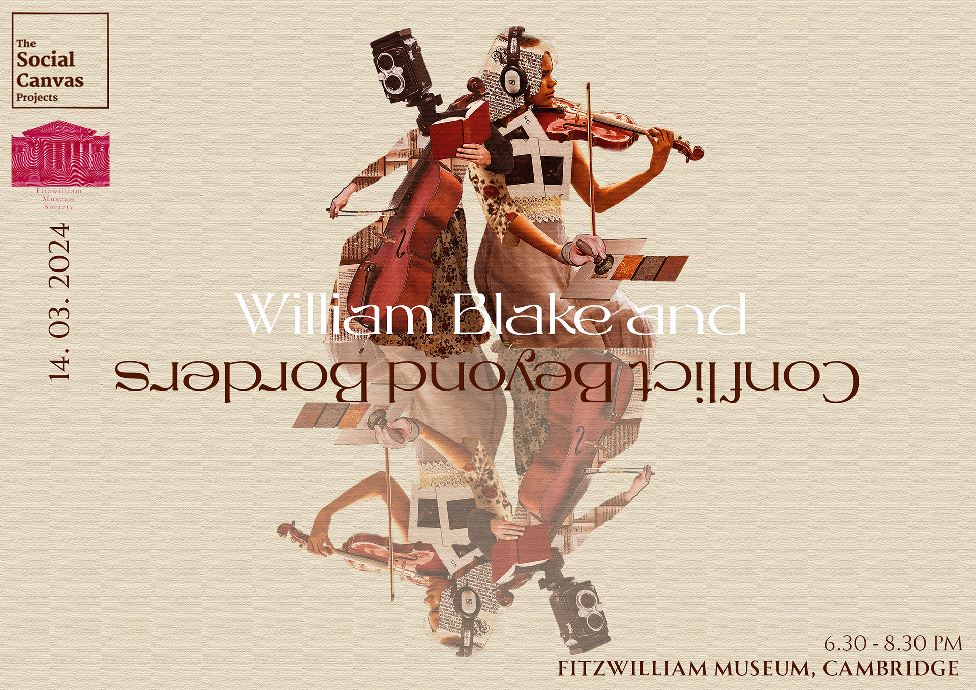
Landscape Version of Event Poster Design
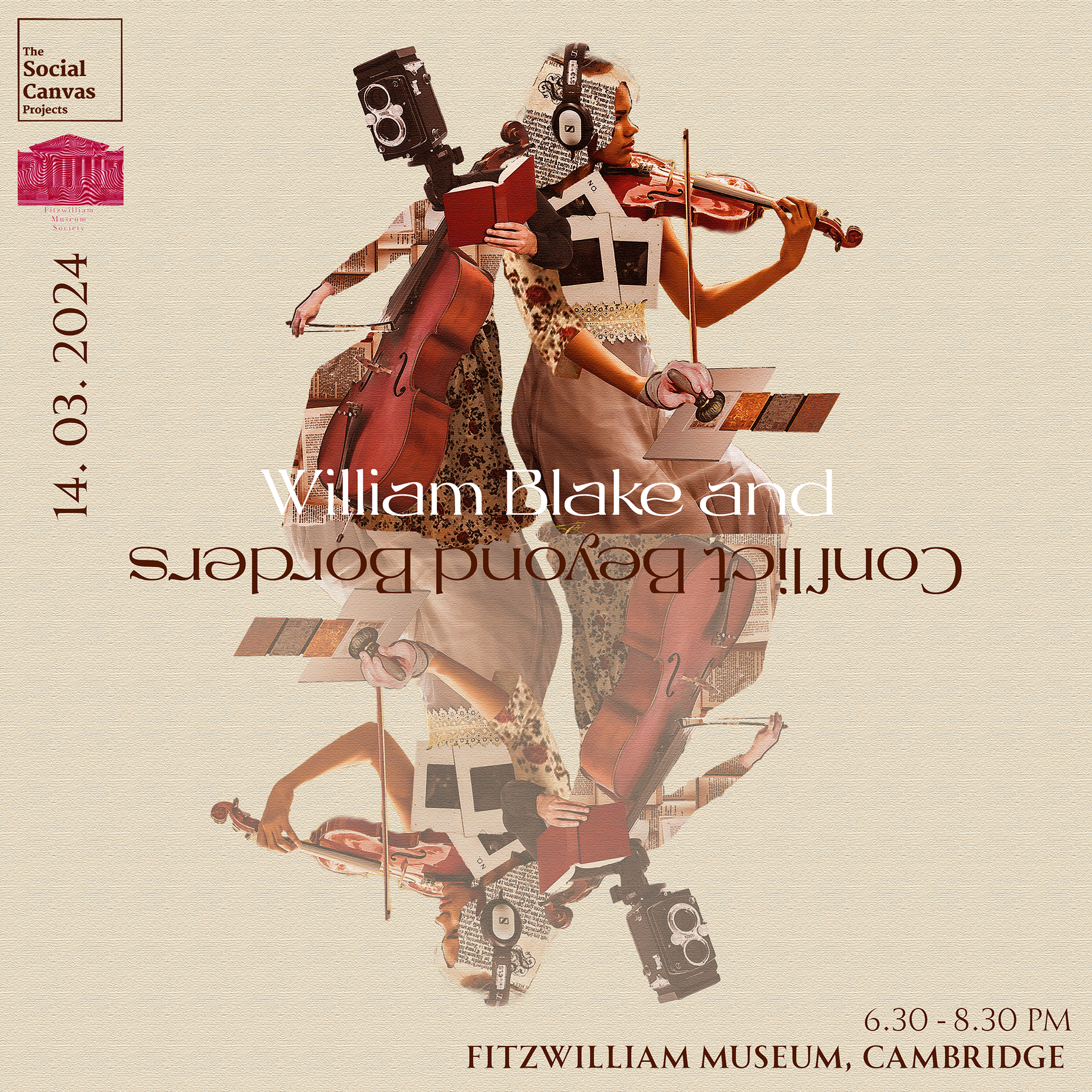
Square Version of Event Poster Design
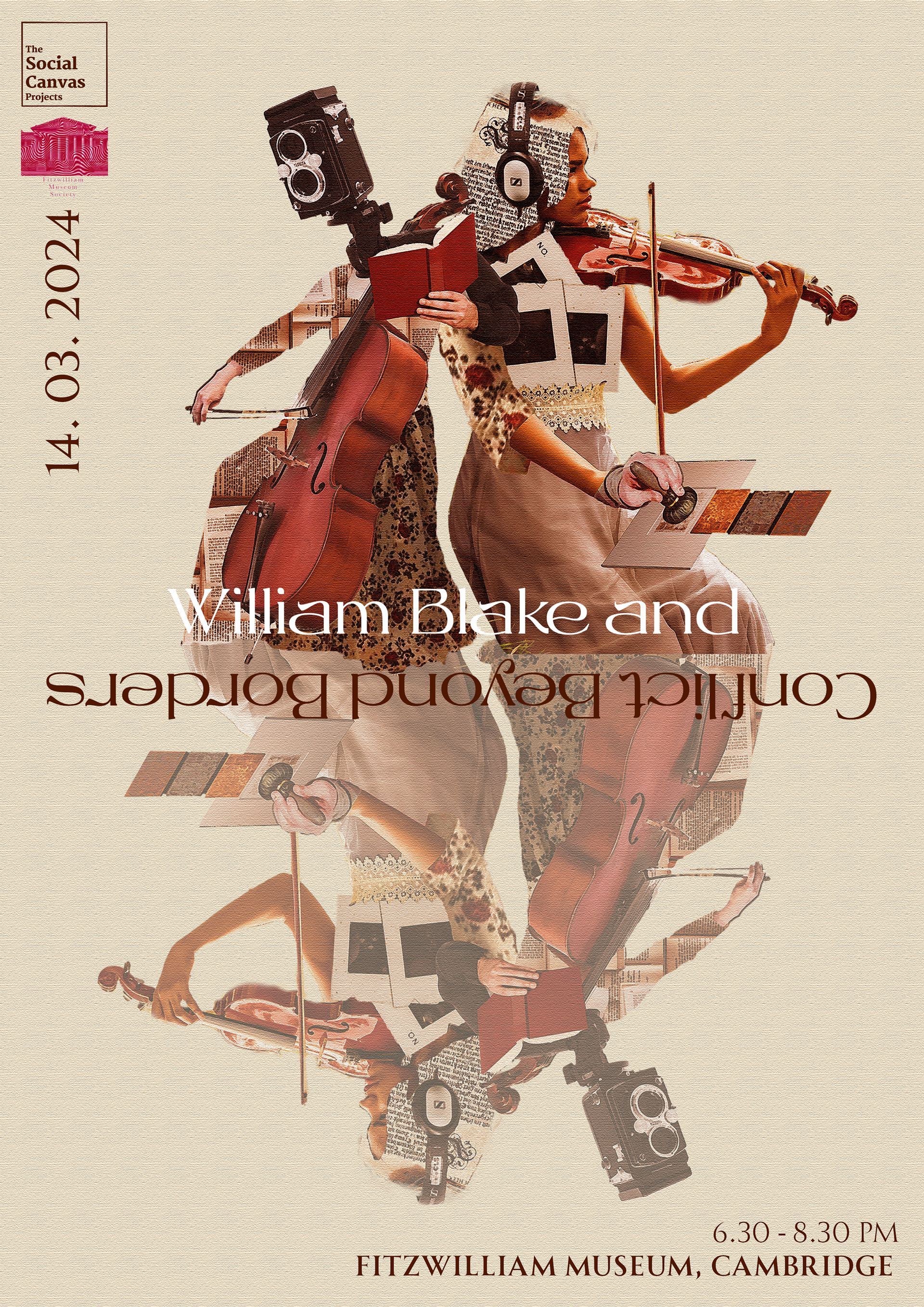
Portrait Version of Event Poster Design
After the meeting about the previous draft, the team leader prefers the second version but would like to have the title more visible with a brownish tone and a reflection visual effect for the image, as well as mixing surrealism in the design, like how William Blake has done with his artworks.
So in this version, I mixed the photography cropped in the previous design to create an underwhelming feeling, for example substituting the cello musician's head with the old camera and the violist's hand with another human's hand. While adjusting the images to brownish and creating a brushed texture, I changed the colour and removed the outlines of the fonts as shown, not just to increase the clarity of the text but to create a contrast.
Draft Version Event Poster Design in Week 4
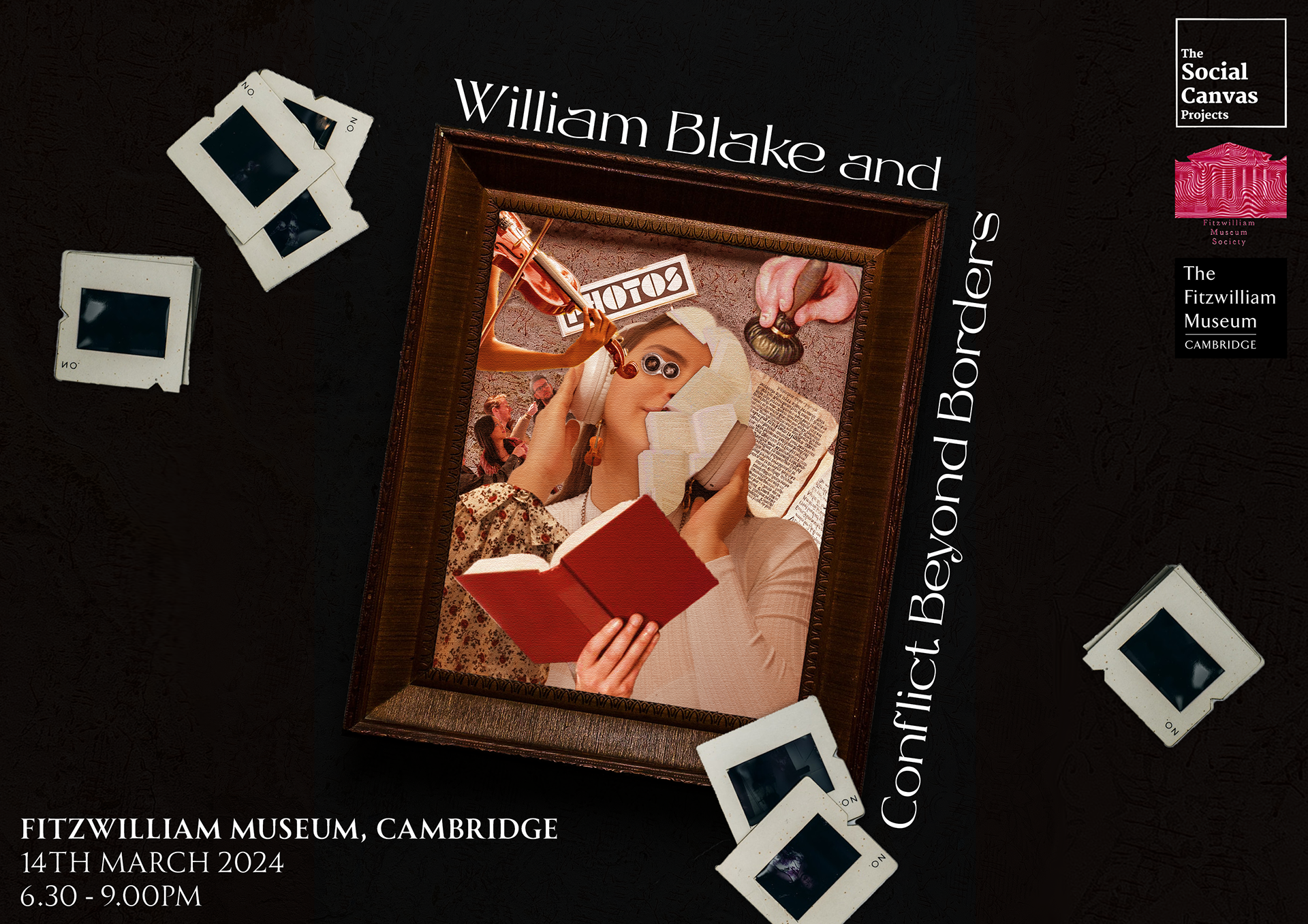
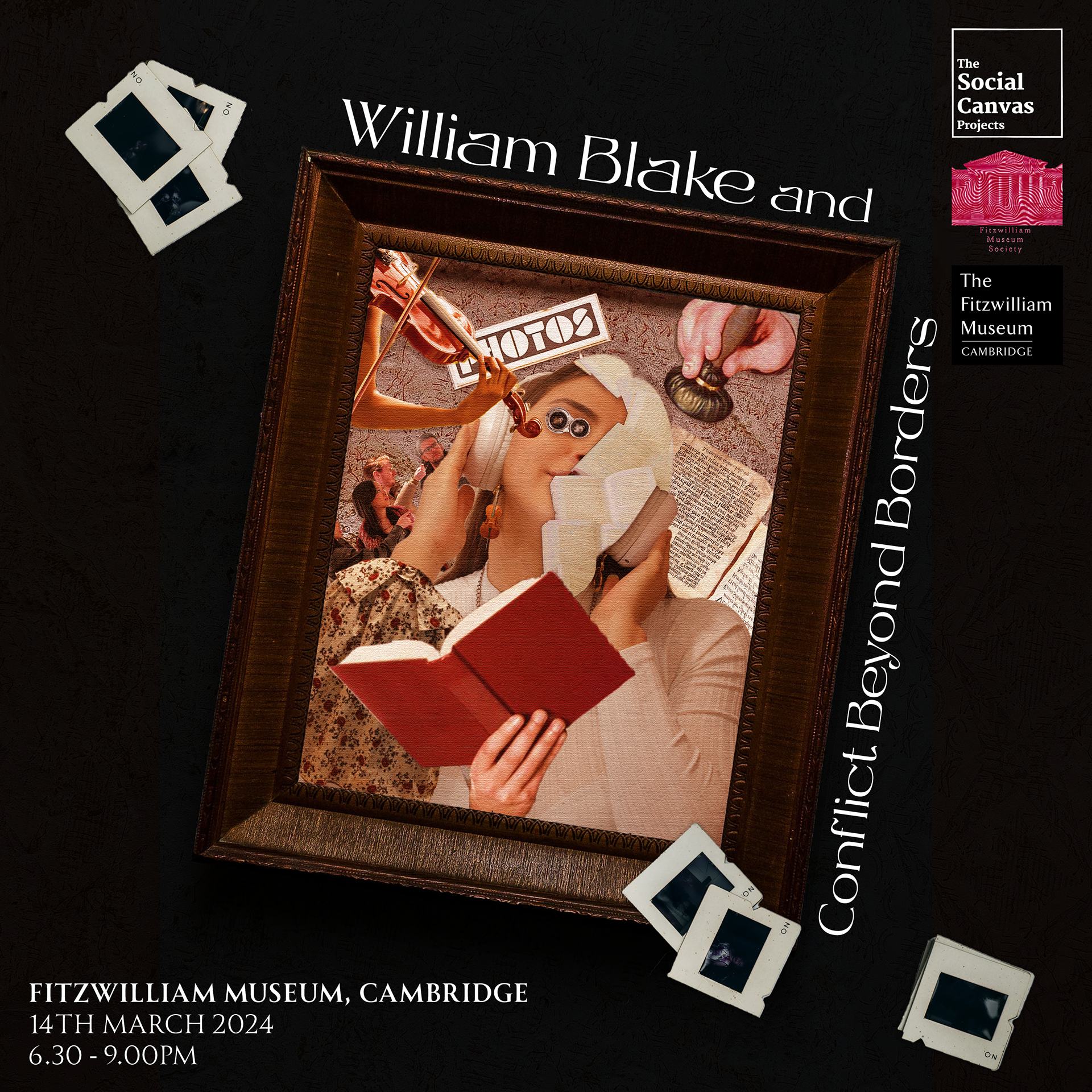
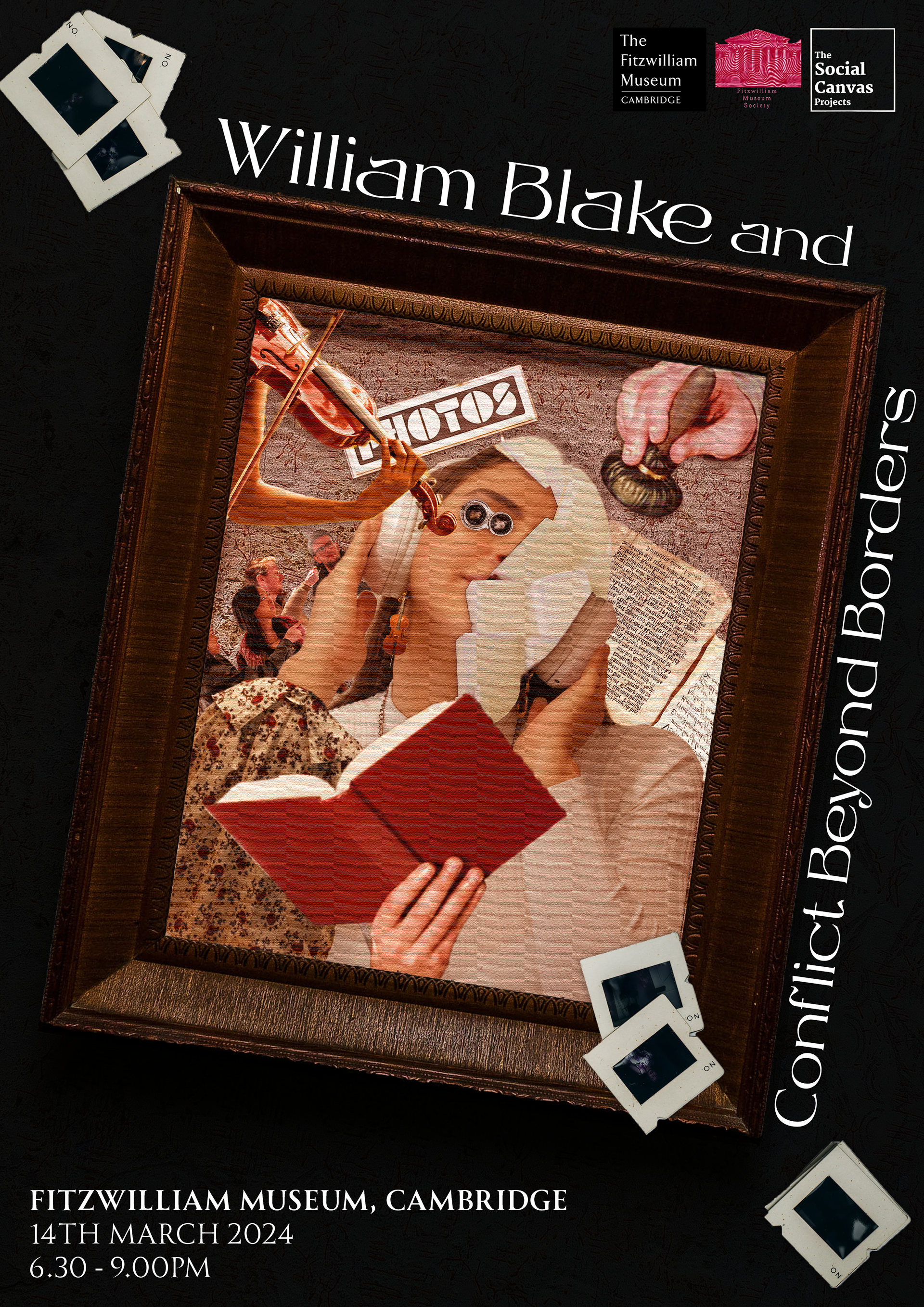
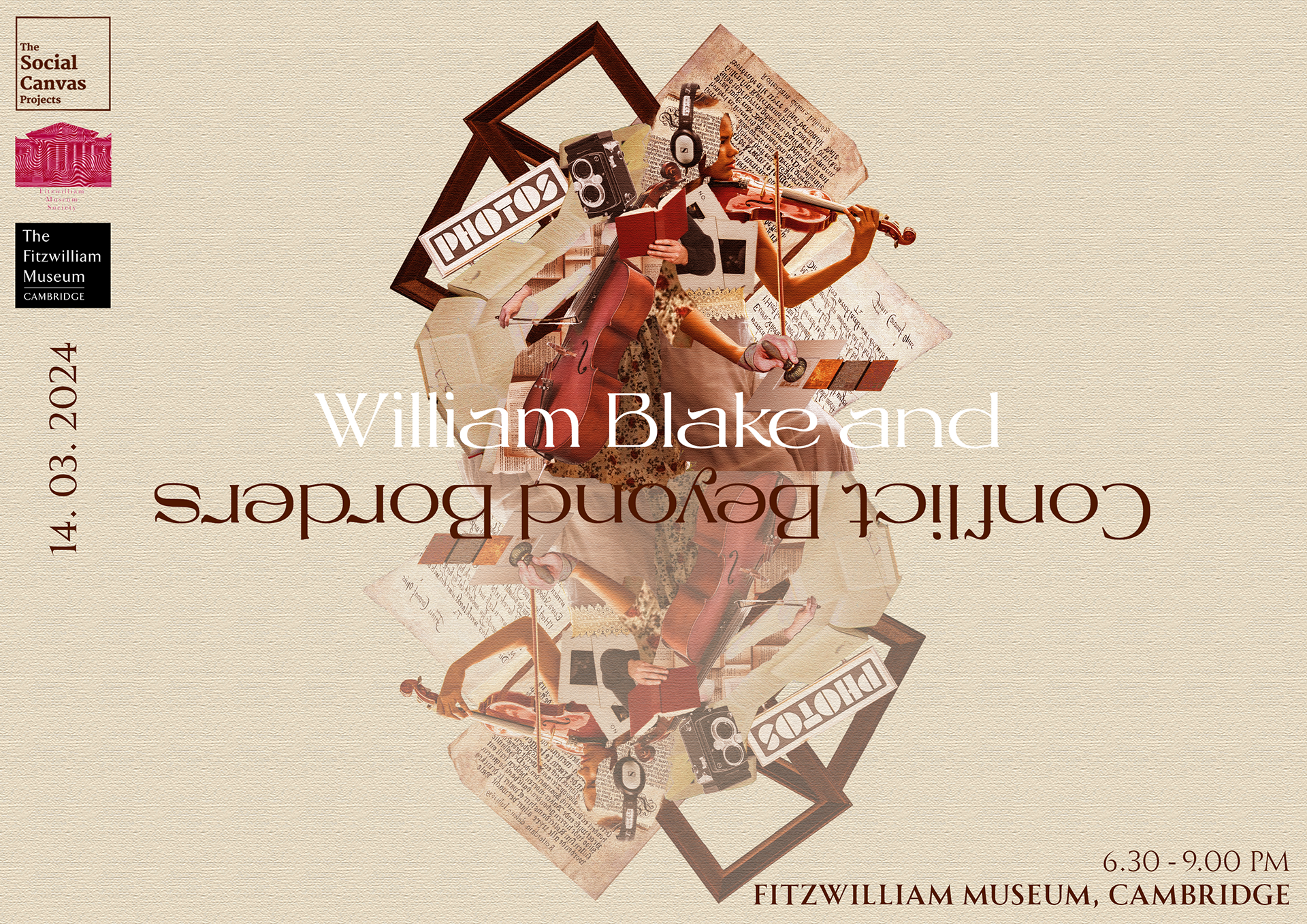
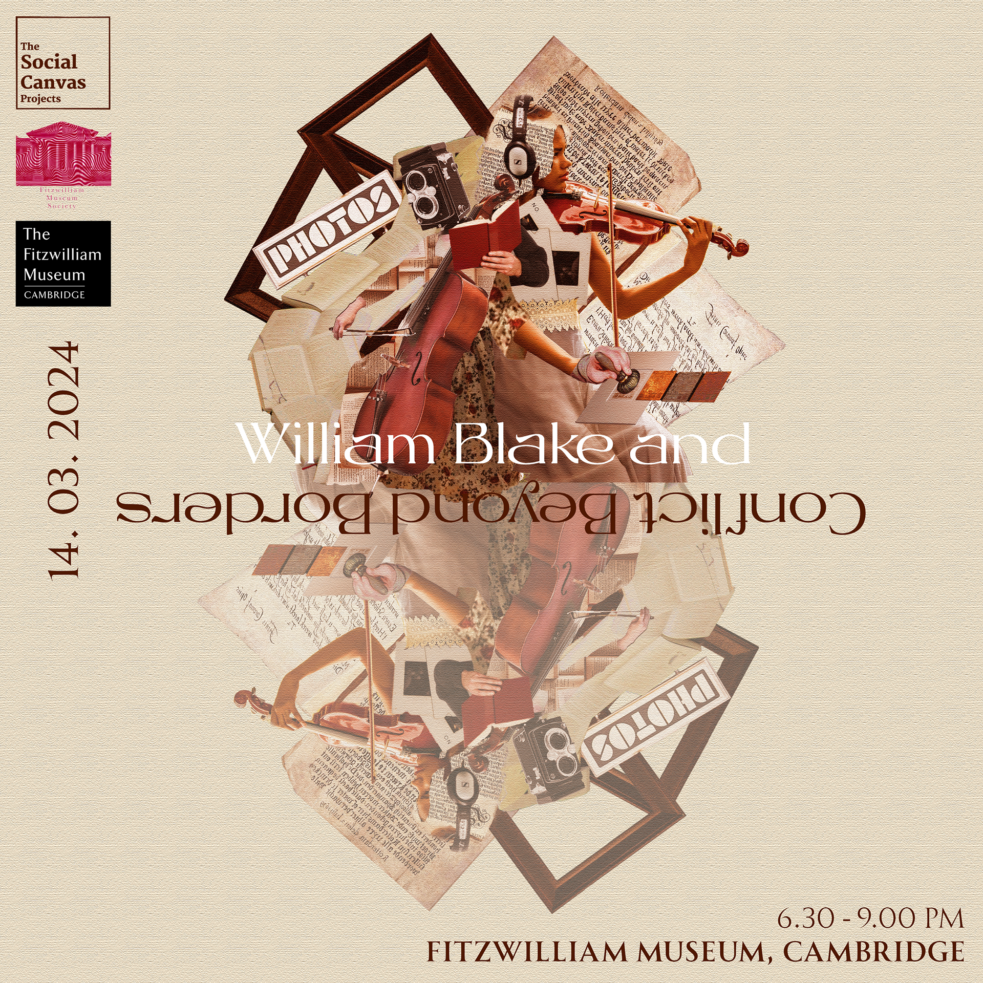
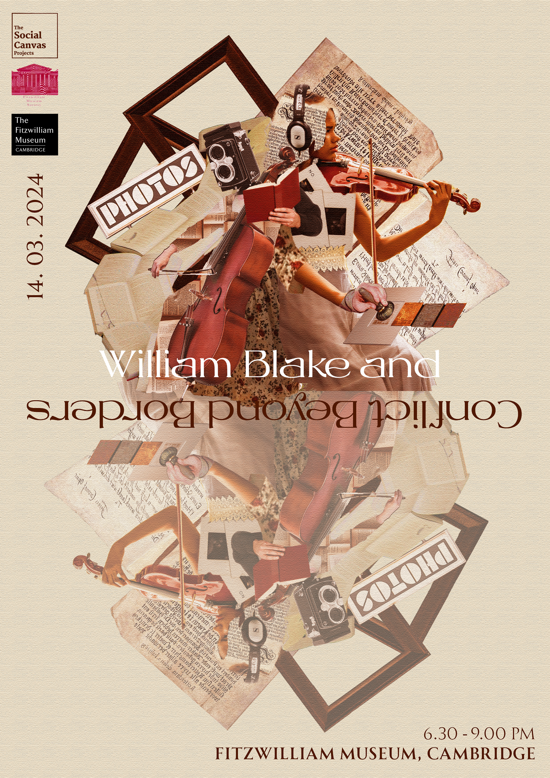
Final Event Poster Design
Leaflet Design
In this leaflet design, I tried to create visuals with a similar style and colour tone of using collages for showcasing our activities in the event.
Teaser for "Academic perspectives on blake"
Storybroad
In the teaser, I showcased the name of guests and art pieces they're going to talk about for the discussion panel, one of our activity for the event.Since we don't have any live-action footage of the event and cannot shows the photo of our guests for the teaser, I mainly used graphics related to the topic our guests will discuss, such as the art piece Albion Rose by William Blake.
In the final version of the teaser, apart from changing the texts and information of the activity, I changed some colour themes and visual elements to match the old and vintage vibe that showed in other graphic designs, such as changing the mic to a gramophone.
Teaser for "Relief Etching Printmaking Workshop, Zine Fair & Photo Booth"
Storybroad
In this teaser, I need to showcase three of the activities we're going to have on the event, including Printmaking Workshop, Zine Fair and Photo Booth. I have used photography that I used in my previous graphic designs to create consistency in my design and reduce the time cost for adjusting the images, like the pink roses in the leaflet design and the printmaking tool in the poster design.
A5 Programme Layout Design
This layout design will be used as one of the pages for the event programme to showcase the artworks that are going to be in the student exhibition around the topic "Regenerative Power of War", created with Adobe Illustrator.
Instagram Post Design
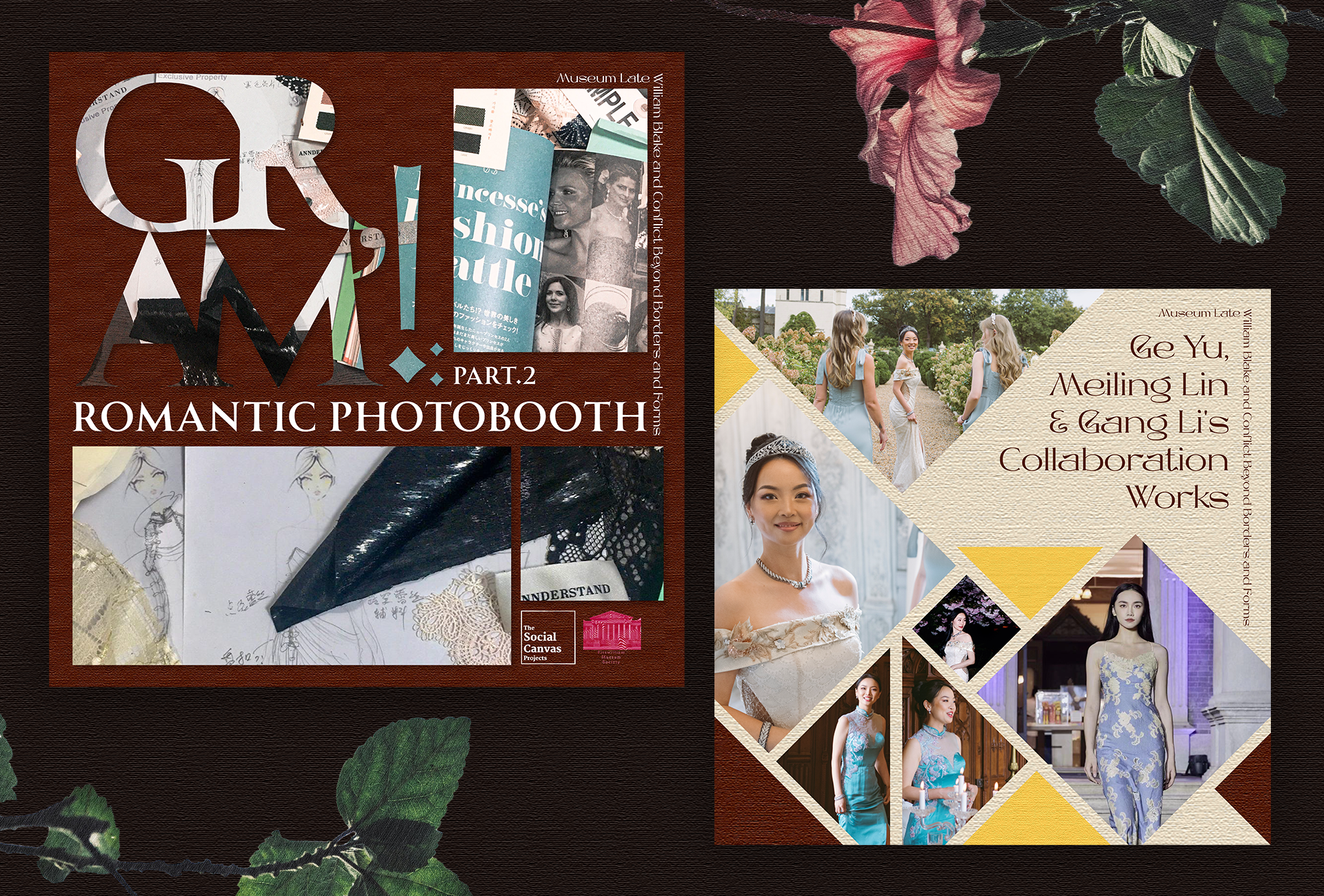
Using Adobe Illustrator, I created 2 Instagram post designs for the fashion designer and her works, who is going to participate in one of our activity, Photo Booth: Fashioning conflict work in the event.
